These sixteen palettes range from a single muted tone like dusty plum to layered pairs like teal and emerald with champagne between them, and the right one depends more on your venue’s light at 7 PM than on any inspiration board.
1. Burgundy & Forest Green
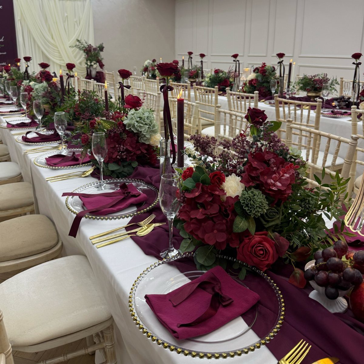
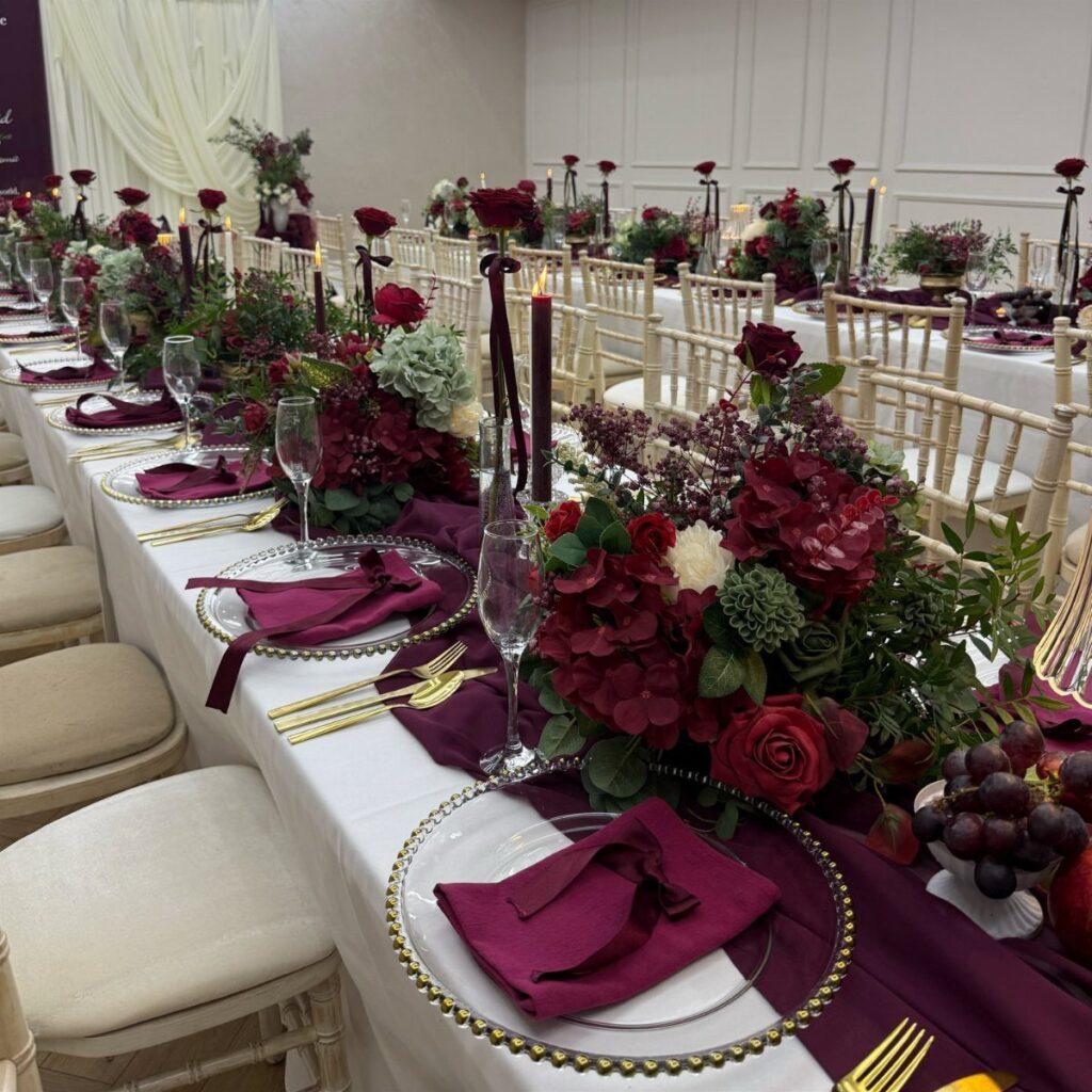
Burgundy and forest green take the holiday palette you already know and give it a heavier, more grown-up hand.
The pairing reads as regal without needing much else, though gold flatware or bronze candlesticks push it further into formal territory if that is where your venue sits.
I like this one for December weddings in particular because it borrows the warmth people expect that month without the full Christmas décor look.
The deep tones also hide low light well, so it suits evening receptions or halls with small windows.
If your budget runs tight, put the money into the runner and napkins and let the greenery come from pine or cedar branches bought by the bunch.
The flowers can be fewer and still hold their own against that dark base.
VERSATILE FIT DIFFERENT TABLES: With dimensions of 54in x 108in, Pureegg disposable tablecloths accommodate various table shapes and sizes (Rectangular table size ≤ 4.5ft x 8.9ft, Round table size ≤ 7ft). Moreover, these table covers can also be used for smaller tables, such as folding buffets, outdoor picnics, and dining tables of various kinds.

FITS 48 AND 60 INCH ROUND TABLES: Each emerald green round tablecloth measures 84 inches across, giving a full drop on a 48 inch table and a lap-length drop on a 60 inch banquet round. Twelve covers per pack. Also sold as emerald green table cloth and emerald green tablecloth.
2. Emerald & Champagne
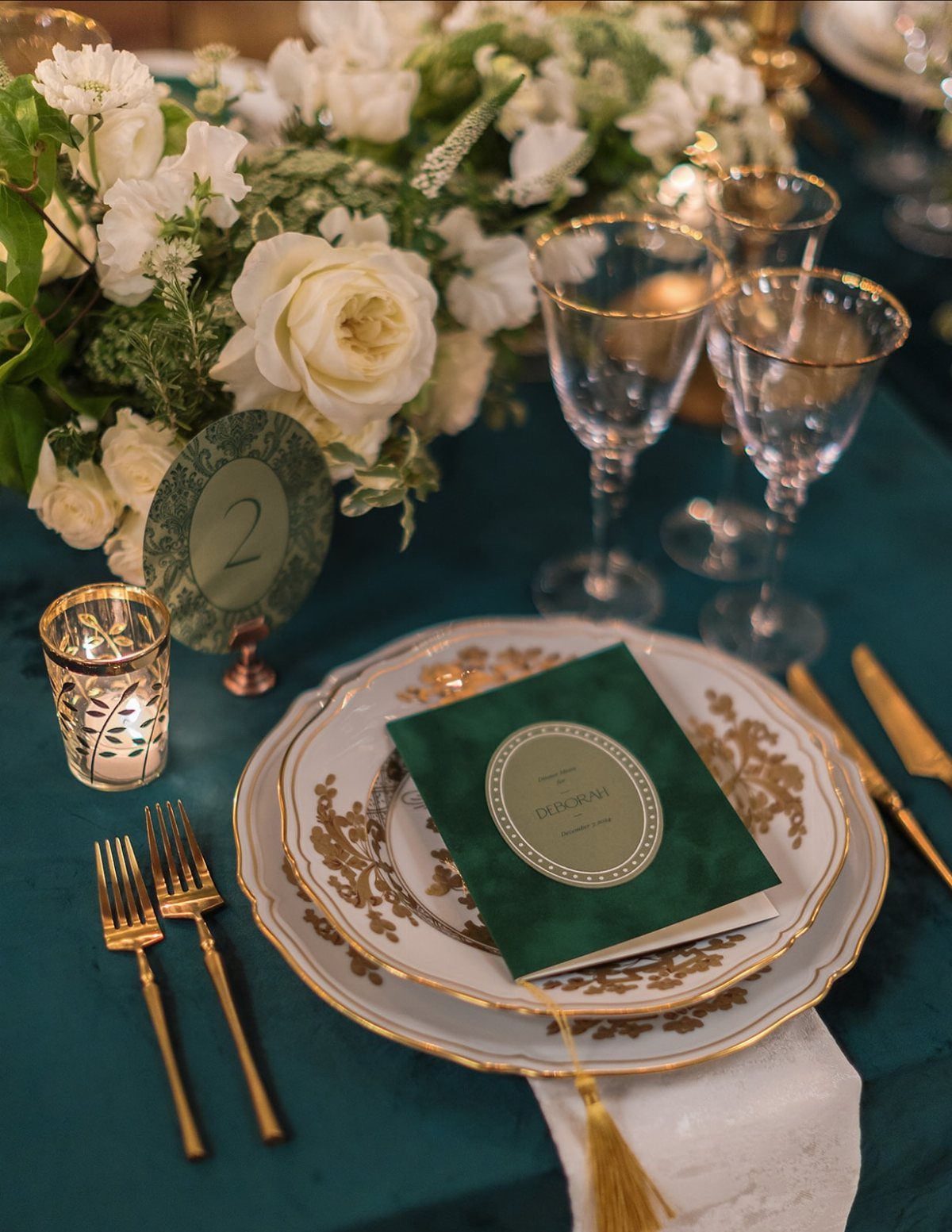
Emerald green carries enough weight to feel like winter, but the champagne keeps it from sinking into moody territory.
The balance matters if you are marrying in late February or early March and want the season without the full dark palette.
The green behaves almost as a neutral here, which means you can thread in small hits of another color without the whole thing feeling scattered.
A dusty rose in the place cards or a cranberry in the cocktail napkins would not fight the main pair.
For the table, I would start with the cloth in emerald and build up through plates with gold rims and cream stationary.
The champagne reads as warmth against the green rather than as a second strong color, so the effect stays calm rather than busy.

Comprehensive Packaging: you will receive 24 bows for chairs wedding that can be tied to the chairs to make chair sashes bows; The sufficient quantity can easily meet your party decoration needs and replacement requirements

1.Material : Premium artificial eucalyptus and willow vine comes with artificial foam roses, small white floral artificial rose leaves and gold shinny pearls, the realistic and natural flowers perfectly blend with eucalyptus

❤️Material: Floroom Studio's artificial roses are crafted from soft, high-quality PE foam, which lends them the look and feel of fresh flowers.
3. White & Ice Blue
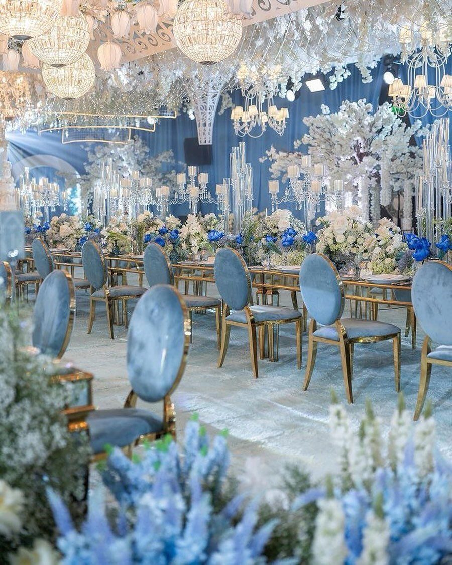
Ice blue and white give you the winter landscape without the literal snow machine. The tone is cold in the best way, quiet and bright, and it works in a large hall where darker colors might swallow the space.
Velvet chairs in ice blue make this palette feel intentional rather than washed out.
Fabric with some weight to it keeps the pale palette from seeming accidental or, worse, like a baby shower. Crystal or glass pieces catch what light there is and bounce it back, so add those where you can.
I would watch the undertone of your white.
A warm ivory against ice blue turns muddy fast. Ask for fabric swatches and hold them under the actual bulbs at your venue before you commit.

Quantity: 1 Chair Slipcover Material: Satin Color: White | Blue Style: Chinoiserie Floral Print Back of Chair: Bottom to Top Height: 35" Width of Square-Top: 15" Front Covering: 16"H x 15"W Fits: Standard Chiavari Chairs Feature: Soft, textured feel with sheen finish
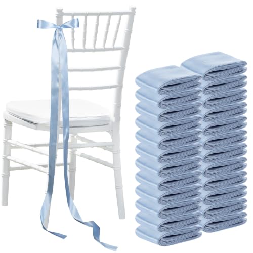
Comprehensive Packaging: you will receive 24 bows for chairs wedding that can be tied to the chairs to make chair sashes bows; The sufficient quantity can easily meet your party decoration needs and replacement requirements

Quantity: 5 Chair Sashes Material: Polyester Style: French Toile Floral Print Thickness: 150GSM
4. Lavender & Silver
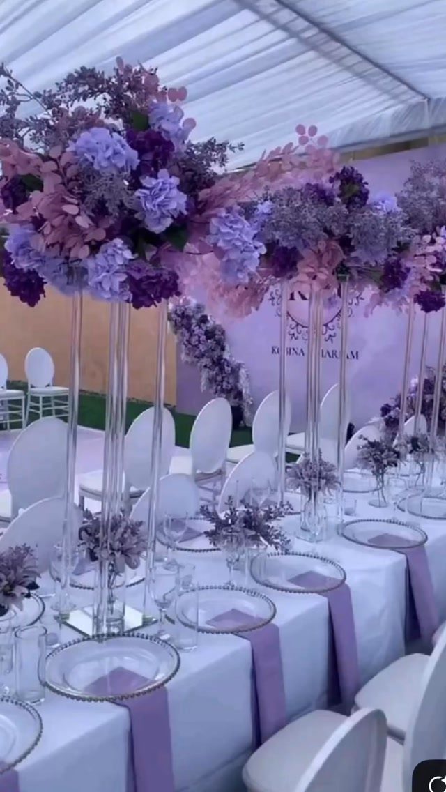
Lavender against silver and slate reads as color kept under strict control, a small soft note in an otherwise sharp, cool room. It suits couples who want a hint of something floral or romantic without the full pastel treatment.
The silver does most of the work here, reflecting light and carrying the winter feeling. The lavender appears in small doses, napkins or a single stem in an arrangement, enough to keep the eye moving but not enough to dominate.
Tall glass stands help because they put the color at eye level without cluttering the table surface.
If you are working with a neutral venue, this palette builds the atmosphere rather than fighting the existing walls and floors. That saves money on draping or other cover-ups.

PURPLE CANDLE HOLDERS❤️--Antiqued Metallic Finish: Mercury speckled effect on the purple tealight holder will enhance the natural warm light of candles, giving it a vintage but vibrant look. Use these pretty green mercury glass votives as part of your overall decor, they will take the elegance of your decoration up by several notches.

What You Will Receive: the package contains 12 pieces of larger paper butterflies in 2 different sizes, 2 pieces for larger size and 10 pieces for smaller size, sufficient to meet your wall decoration and crafting needs
5. Red, Blush & Gold
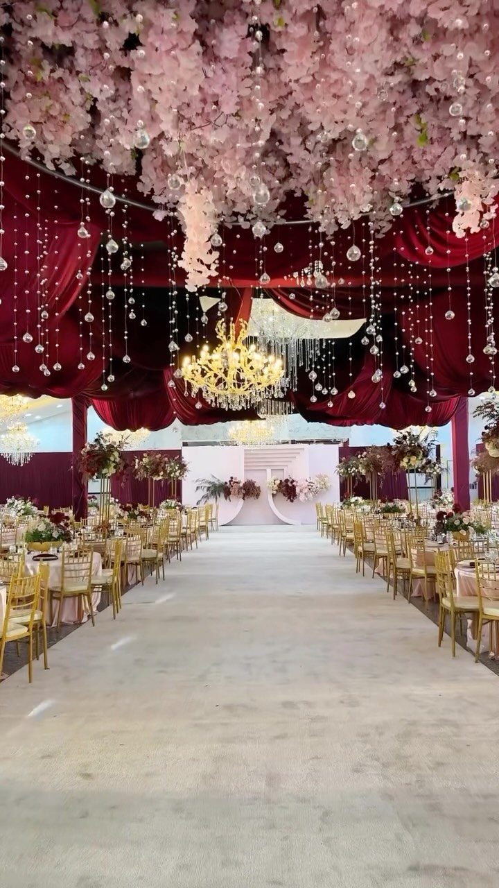
Red with blush instead of green sidesteps the Christmas palette entirely. The red stays bold and warm, but the blush softens its edge and the gold adds the expected formal lift for a winter evening.
Ceiling drapes in deep red absorb a lot of visual space, so this works best in a venue with height enough to carry it.
In a smaller room I would move the red down to table runners and let the blush take the larger fabric areas.
Gold chair frames or flatware repeat without needing to be everywhere. I would put the money into fewer, better pieces of true metal rather than spray-painted alternatives that chip by the end of the night.

PLASTIC CHAMPAGNE FLUTES DISPOSABLE OR REUSABLE: Chateau Fine Tableware plastic champagne glasses come in a convenient, 36-count package. After use, dispose of, recycle or hand wash plastic champagne flutes and plastic cocktail glasses for future events.

Gradient Handle Design - New products of VANVRO classic silverware cutlery,flatware set series : Gradient gold Handle Mirror Polished Flatware Set,Add four colors to choose from.The design of fashion trends is a kind of enjoyment both visually and in dining experience.

Made from 18/0 Stainless Steel
6. Dusty Blue & Blush
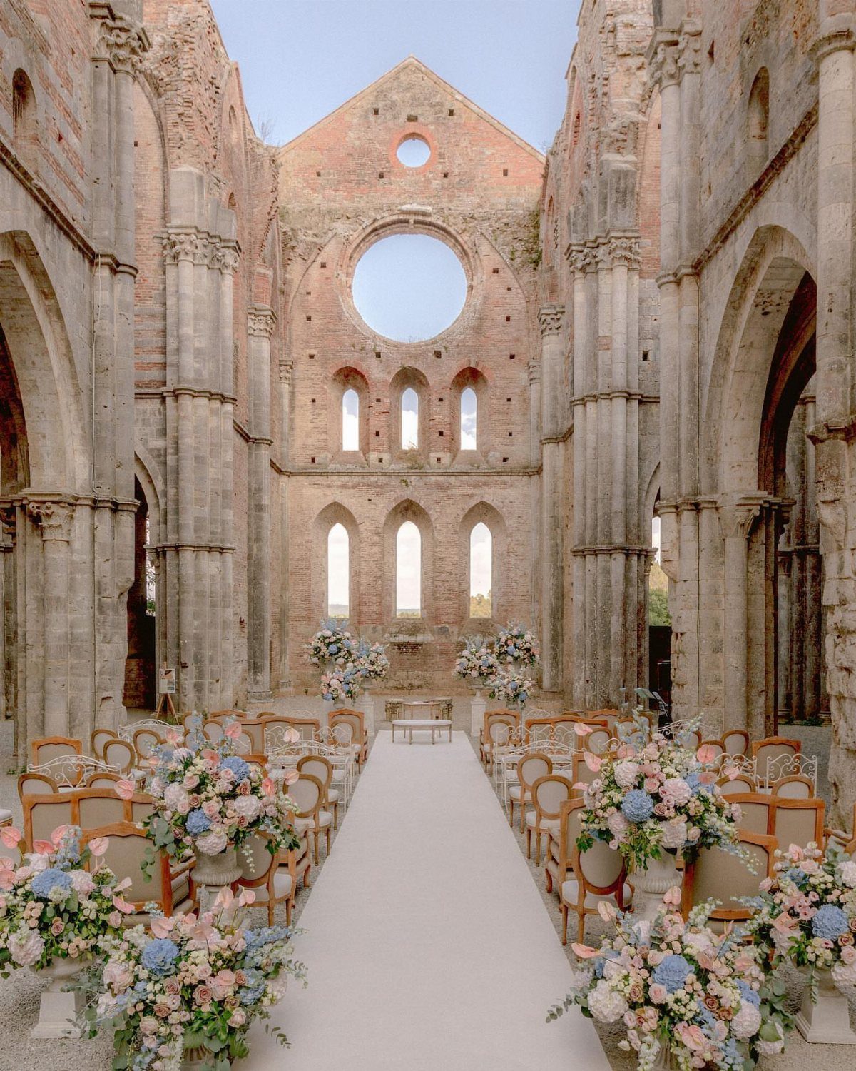
Dusty blue and blush sit low in saturation, which makes them forgiving in mixed daylight and indoor light. That matters for winter when the ceremony might be mid-afternoon and the reception runs into evening.
If your venue is plain drywall or generic hotel carpet, you will need to add that layer of texture elsewhere.
Rough linen napkins, wooden pedestals, or even just a runner with some slub to it keeps the palette from feeling too flat.
Both colors read as gentle, so this is the choice if your aim is romantic rather than formal. I would keep the metals to soft gold or antique brass rather than anything high polish or chrome.

Quality Material: Aocoz round tablecloth is made of 100% durable polyester, it can be reused after washing, and it does not contain harmful chemicals and has no odor, which is good for protecting your table, and can also make your parties more atmosphere. The polyester fabric is soft and lightweight, so it drapes naturally

6 PACK VALUE - this 6 pack includes 6 disposable Emerald Green plastic table cloths that each measure 54 x 108 inches and work as a Emerald Green table cloth rectangle cover for 6 foot rectangle tables and 8 foot rectangle tables great for banquet folding and dining tables

FITS 6 FOOT TABLES – 8 pack of 60 x 102 inch tablecloths, sized for a 6 ft (30 x 72 in) banquet or folding table with a 15-inch drop on all sides. Also fits 4 ft and 5 ft tables with a longer drop. This is not a floor-length tablecloth; not recommended for 8 ft tables.
7. Grey & Greenery
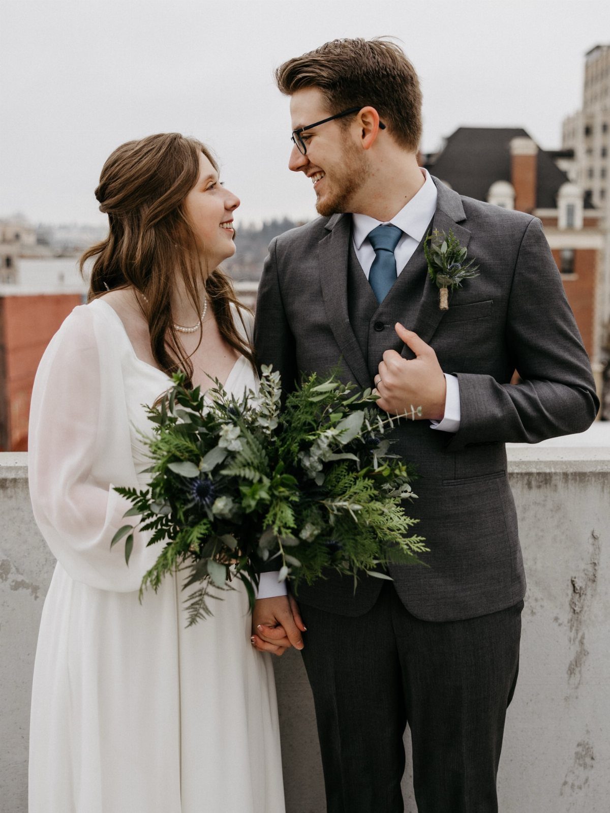
Grey and greenery strip the palette back to something quiet that still reads as winter.
Charcoal suiting ground the look without the heaviness of black, and the greenery carries the seasonal cue without any red in sight.
Pine or cedar branches cost less than eucalyptus in winter because they are local and abundant, so this is a practical place to start if your budget is modest.
A large greenery bouquet needs structure or it collapses into a shapeless mound; wire or a firm base keeps the shape.
Ask your florist for a mix of stiff pine with something softer, and hold the sample against your grey fabric before you book.

DISTINCTIVE BURGUNDY+GOLD DESIGN -- Giving a Gorgeous But Timeless Look: We chose to add gold to the top of the burgundy cup body to add a sense of sophistication, perfect for burgundy and gold-themed decoration. Mercury speckled effect on the votive candle holders will enhance the natural warm light of candles, keep shining in your life.

Classic Christmas Ball Ornaments--These basic 36 combination Christmas balls have solid colors and different unique Christmas element shapes, such as glazed, matte, glitter and faceted. These classic Christmas balls decorations are perfect for decorating your Christmas tree and lighting up your holiday.

Event Decorator Design for party planners, wedding stylists, celebration planners, and creative event professionals. Event styling, wedding decor, party planning, venue decoration, celebration setup, creative decorating theme.
8. Dusty Plum
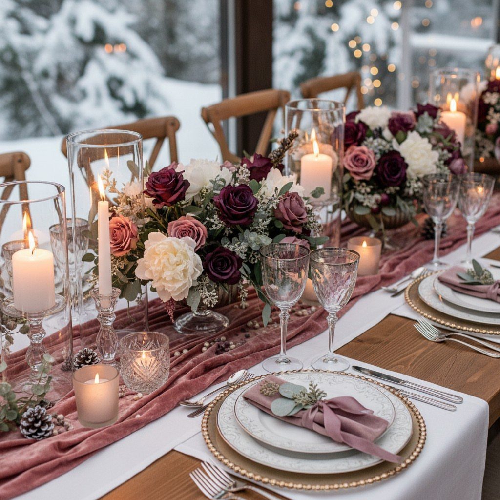
Dusty plum carries purple into winter by draining the brightness out of it, the way late afternoon light does to a room.
Velvet in this color behaves well under artificial light, which matters when your reception runs on candles after dark.
Runners and napkins in this fabric do the visual work so the flowers can be simple white roses rather than dyed blooms that bruise.
This palette needs a neutral to rest against.
A snowy backdrop gives that break; in a hotel ballroom with cream walls, I would add white chargers or a pale table base so the plum does not pool into something too dark.
A dustier, quieter version of the color you already love.

Quantity: 5 Chair Sashes Material: Spandex Style: French Toile Floral Pattern

Wedding Aisle Decoration Package: Set of 8 (2 pcs for each set, 16 pcs in the whole package), 8 clear non-marking tapes, and 8 thin straps.

❤️【Wedding Aisle Decorations】: Our wedding aisle decorations flowers are composed of dusty blue roses, white rose, gold berries, tiny flowers and rose leaves. These chair flowers are full in shape, rich in layers and vivid in color, bright up your wedding decorations.
9. Navy Blue and Gold
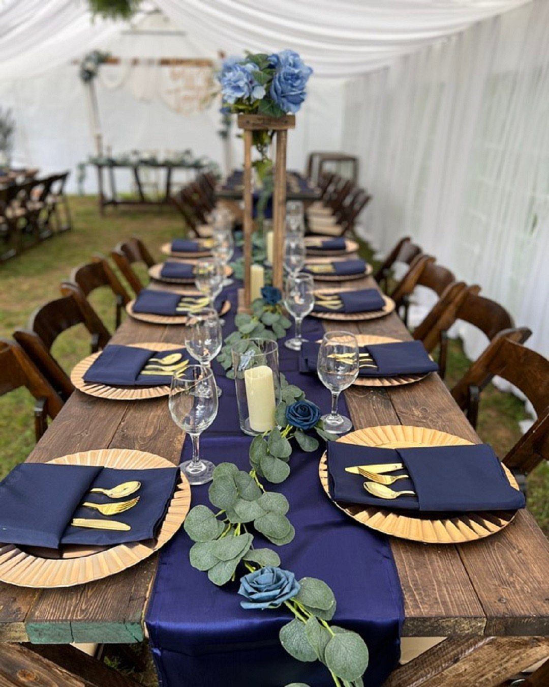
Navy and gold borrow from formal evening wear, and that is exactly the register they set for a wedding.
A banquet table can run navy through the runner and napkins, not the cloth, which keeps the cost down while gold chargers and cutlery signal intention.
Blue roses are an unusual touch I would not count on finding locally; the palette works as well with white flowers or greenery, and either is easier to source in January.
This one suits a tented reception or any space with wood grain already in it. The navy frames the gold rather than competing, and the pair needs no third color to feel complete.

Occassion: Silk Rose Petals work great for Bridal showers, Parties, Weddings, Anniversaries, Celebrations,Wedding Flower Girl Baskets,Bouquet,Table decoration, and much more.

12PCS VALUE PACK: you will get 6 rose candle rings and 6 led flameless candles (battery not included), 12pcs ensuring you have quantity for a complete table centerpieces decoration or to use them spread across different places at your home or venue.

Lifelike artificial lavender, pure and elegant, can work with other silk flowers to create lovely bouquets for DIY floral arrangements decor ,that fits perfectly into your personal decor.
10. Teal and Emerald Green
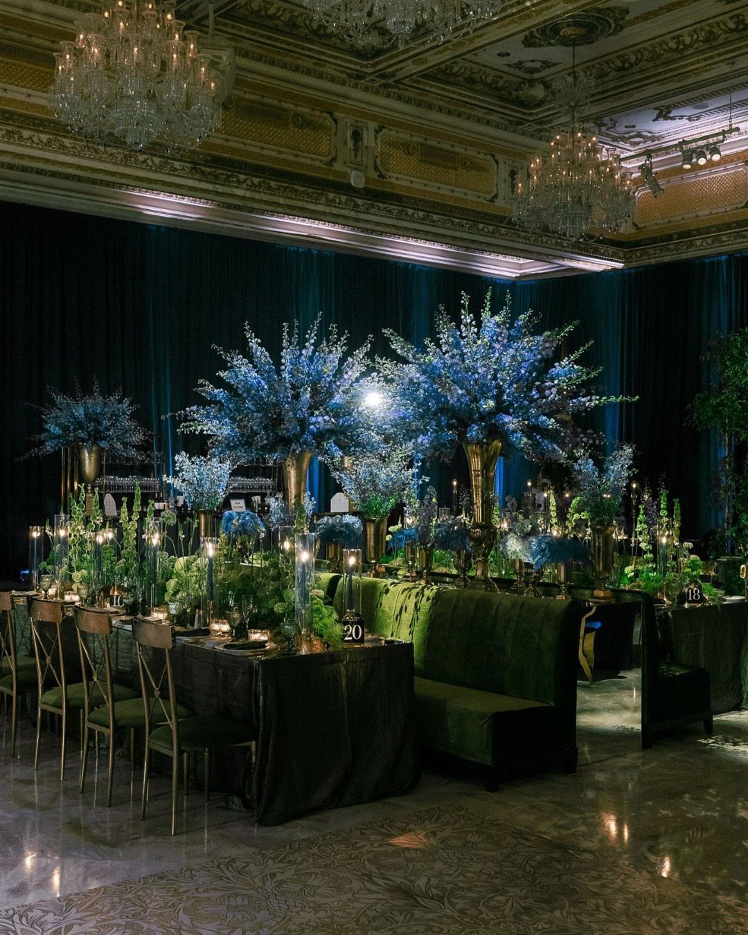
Teal and emerald green stack 2 saturated colors that should fight but do not, because the gold in between acts as referee.
This palette demands texture to survive; drapery and velvet seating carry it when flat surfaces would flatten the color too.
Satin or flat paint would look like a color chart; velvet and heavy linen give each tone a surface to live on.
Tall floral pieces in blue with gold vases repeat the structure of the drapery rather than matching it exactly.
This one asks for a ballroom or at least a space with height. In a low-ceilinged room, I would drop the tall centerpieces and let the drapery go, keeping just the green seating and gold points.

LOOKS LIKE REAL GLASSWARE: The crystal-clear body and faceted shape fool guests until they pick one up. Thick, food-grade walls resist drops on patios and pool decks.

【High Quality】Made of high quality 18/10 stainless steel material,sturdy &durable, Corrosion & High Temperature Resistant. Safe and healthy for daily use, dishwasher safe.

1. Elevate Your Dining Experience: Add a touch of luxury to your table with this stunning 60-piece gold silverware set, meticulously crafted from high-quality stainless steel and elegantly titanium plated.
11. Dark Green and White
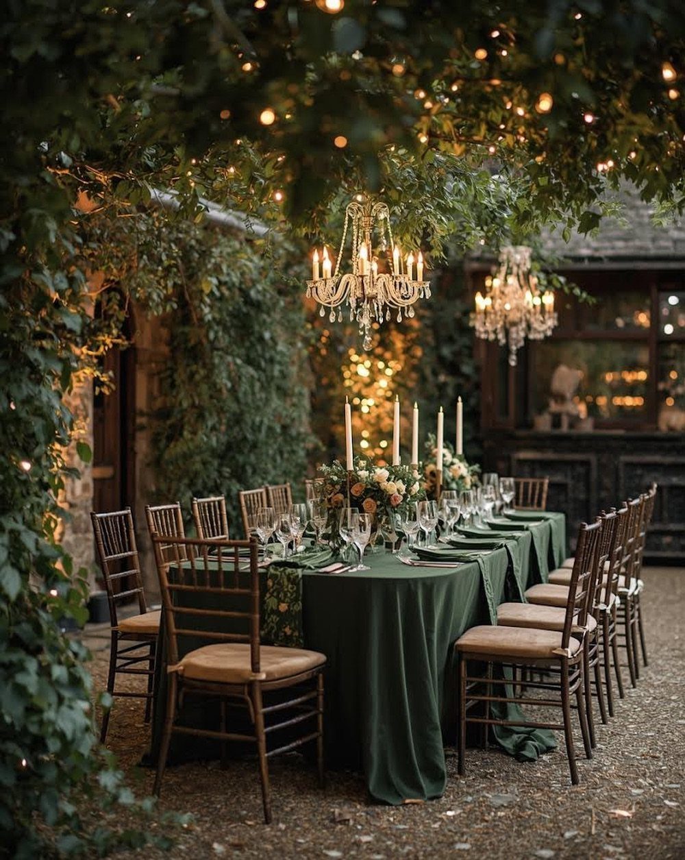
Dark green cloth with white candles is the simplest pairing on this list, and it relies entirely on contrast and material to keep from going flat.
The green reads as depth and the white as light source, not as 2 competing colors; that is the balance to aim for.
Crystal chandeliers hung from branches add a third texture, but the entry point is just the cloth and the candles. White tapers are cheap; the green linen is where the money goes, and the quality of that fabric shows.
This setup works outside because the surrounding darkness does the framing. Inside, I would add some natural wood or the space risks feeling like a staged catalog shot rather than a dinner.
12. Dusky Pink & Taupe
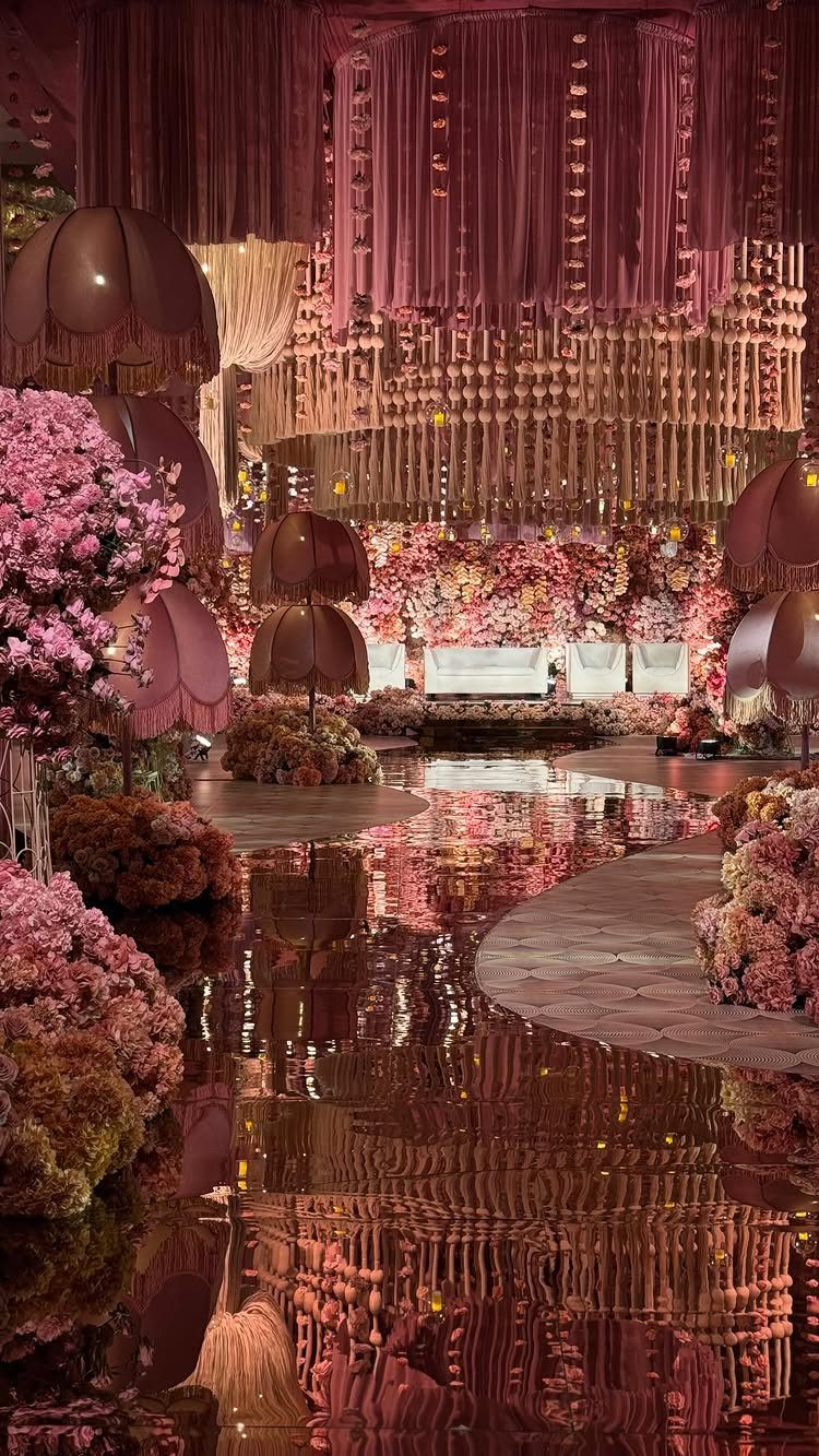
Dusky pink and taupe warm a winter palette by borrowing from the hour after sunset rather than from bright daylight.
This palette depends on shine to keep from sinking into beige; suspended drapery and reflective floors both do that work.
Satin or silk catches light; matte fabric in these colors turns to mud under incandescent bulbs. The oversized lampshades add another plane of pink at eye level, which matters in a hall with a high ceiling.
Taupe reads as neutral in daylight but picks up warm undertones at night, so the pink shifts from obvious to subtle as the evening goes on. A choice for someone who wants softness without the full pastel treatment.
Choosing the Right Colors
Your venue does more to determine your palette than any Pinterest board. A room with dark wood paneling absorbs light differently than white drywall or a tent ceiling, and that changes how saturated your colors read by 7 PM.
Seasonal themes work the same way. A snowy backdrop makes pale colors feel intentional; in a city ballroom with no windows, those same colors need more structure to avoid looking lost.
Ice blue and white bring the winter landscape itself into the room; burgundy and forest green shut the cold out entirely.
Personal preference still matters, but it gets disciplined by what the space can carry. Start with 3 colors from the list that match your venue’s light, then test them at the actual hour of your ceremony.
Incorporating Seasonal Elements
Evergreens are the obvious winter element, but they work differently depending on how you use them.
Pine and cedar branches, cheap and local in December through February, give you structure and scent at entryways or along a runner. Eucalyptus costs more and reads softer, which suits dusty plum or lavender palettes better than rustic ones.
Snowflakes as a motif tire fast; I would limit them to one place, perhaps the invitation liner or a single hanging installation, rather than sprinkling them across every surface.
Warm lighting does more consistent work. Candles shift any palette toward amber after dark, so white and ice blue needs that cool tone locked in with fabric; the light alone will warm it.
For the cozier palettes, burgundy or dusty plum, candlelight completes the intended effect rather than fighting it. Match your lighting plan to the temperature of your colors, not just the room.
Mixing Warm and Cool Tones
Warm and cool tones together create the tension that keeps a winter palette from going flat.
Emerald against champagne, teal against gold, red against blush: these pairings all depend on getting the balance right. Without that opposition, each color would sink into its own temperature and the room would feel one-note.
The risk is in the ratio.
Too equal a split and the eye cannot settle; one tone needs to lead. The advice there, dropping drapery in a low-ceiling room, removes one cool element so the warm metal can balance the remaining green.
If neither recedes, you need a clearer dominant. Winter light changes fast; a combination that reads balanced at 4 PM may not at 7.
Accent Colors
Metallics and greenery serve the same function: they punctuate without becoming a second main color.
Gold, silver, and bronze work best as flatware, chargers, candlesticks, and chair frames; they rarely belong on tablecloths or walls. That scale keeps them from competing.
Greenery operates similarly.
Pine or cedar branches ground the grey palette; eucalyptus softens the emerald and champagne. Use metallics in small, steady doses that match their supporting role.
A single stiff stem in a tall vase carries the lavender and silver combination; a table runner of greenery branches belongs to the grey and greenery palette specifically, where it is the point rather than the accent.
One gold charger at each place, or one bronze candlestick cluster per table, reads as intentional.
The same metal everywhere reads as theme park. Let the main palette do the work; accents earn their place by staying scarce.
Frequently Asked Questions
What is the best color for a winter wedding?
Deep jewel tones, icy blues, and clean whites all work well, but the right choice depends on your venue’s light and your wedding hour.
Can a winter wedding wear black?
Yes, black works for winter and dark colors suit the season in general. Charcoal reads softer than pure black under winter venue lighting, and a black-and-white pairing still feels right for a formal evening without closing off the room.
What to wear to a winter wedding in 2026?
Warm fabrics and layered pieces matter most for guest outfits in cold weather. A guest applying that same principle would look for weight and sheen rather than thin or matte fabrics.