The pink wedding colors here range from barely-there pastels in table linens and bridesmaid dresses to saturated statements loud enough for a draped ballroom ceiling.
What decides which shade belongs in your day is your venue’s existing bones: its light, its height, and whatever colors you cannot change.
1. Dusty Rose & Mauve
Dusty rose and mauve carry the weight of old romance without the fuss of lace and silver.
Dusty rose and mauve read grown-up rather than juvenile; the muted quality keeps the color grounded, and pearlescent accents layered through table linens or candlelight reflections add polish without extra ornament.
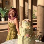
Mauve can take the lead or step back. The micro wedding with the pink hat stuck in my memory because the color worked as accent, not star: warm sunny tones in the bouquet, the hat as the single bold note.
That flexibility matters when your venue has existing colors you cannot change.
White and purple sit naturally here; use them in flowers or glassware where dusty rose might turn flat on its own.

Sold in packages of 100 Napkins. Buy quantity 1 = 100 napkins How to Care: Warm water wash, Do Not Bleach. Low temp dry. Material: 100% polyester, stain & wrinkle resistant....
2. Dusty Rose & Cream
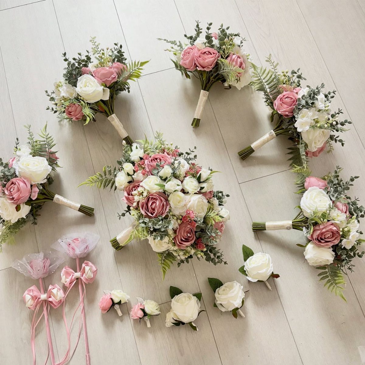
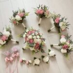
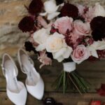
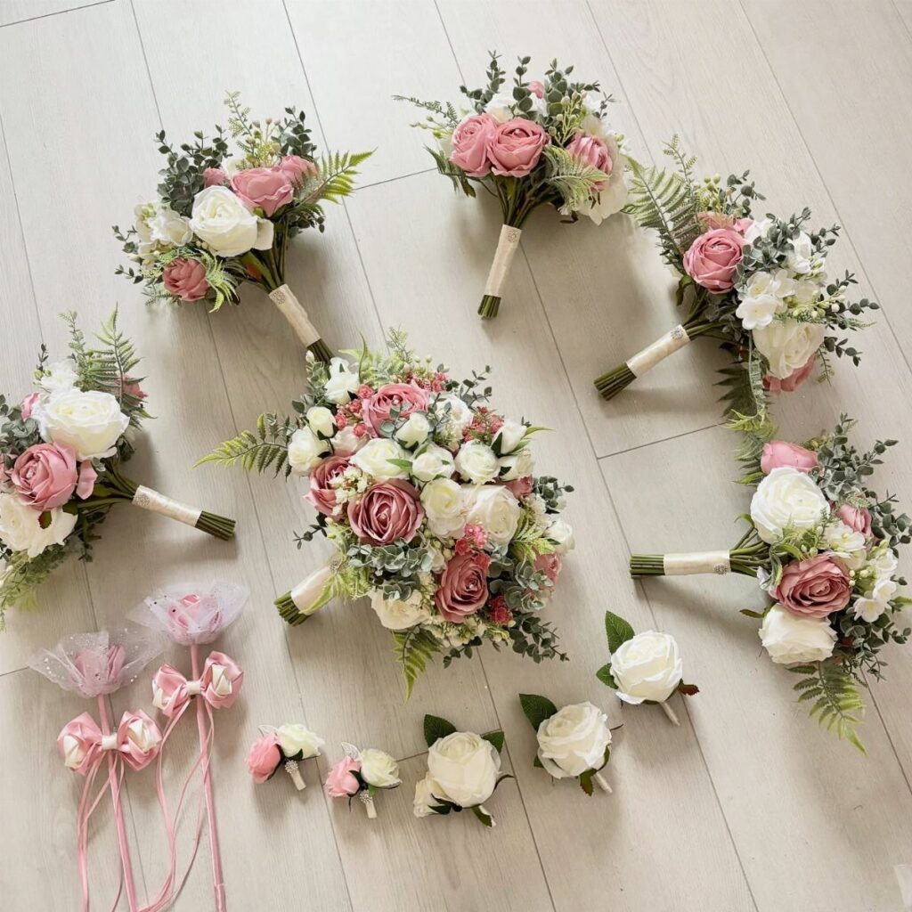
Cream softens dusty rose into something that feels like morning light; these bouquets rest easy on wood because nothing in them shouts.
This palette suits outdoor spring weddings or any space with windows that actually let light through, since both colors need it to read as intended rather than muddy.
Bridesmaid and bridal bouquets that share the same flower mix keep the look unified without matching too exactly.
Matching the bridal party florals to the bride’s keeps the palette coherent without demanding matching dresses. Ribbon wands, visible at the edge, work for flower girls or send-offs; same cream and dusty rose ribbon, cut short.
For guests who ask whether pink is appropriate to wear, dusty rose at a formal event reads as sophisticated, not costume. That question comes up more than you’d expect.

【Gradient Dusty Purple Roses & White Roses】Ready‑to‑use flower bunches with natural gradient color transition. Elegant cool‑toned dusty purple blooms pair with soft cream‑white roses, creating a muted vintage aesthetic for your interior.

Pink Roses Artificial Flowers Set: A combo box packs a variety of flowers vintage farmhouse or rustic themed wedding centerpieces. A total of 21 fake flowers and 3 accessories, including mixed silk and foam dusty pink roses artificial flowers with stems

THE PERFECT BOUQUET CHOICE: This dusty rose artificial bridal bouquet for brides is full and has a realistic look, lightweight and easy to carry, with a soft handle securely wired to prevent mishaps, helping you complete the entire wedding effortlessly. Adorned with pearls and crystals, the details are perfected. Its elegant look and unique design ensure you stand out and become the center of attention on your big day.
3. Blush Flowers with Hot Pink Accents
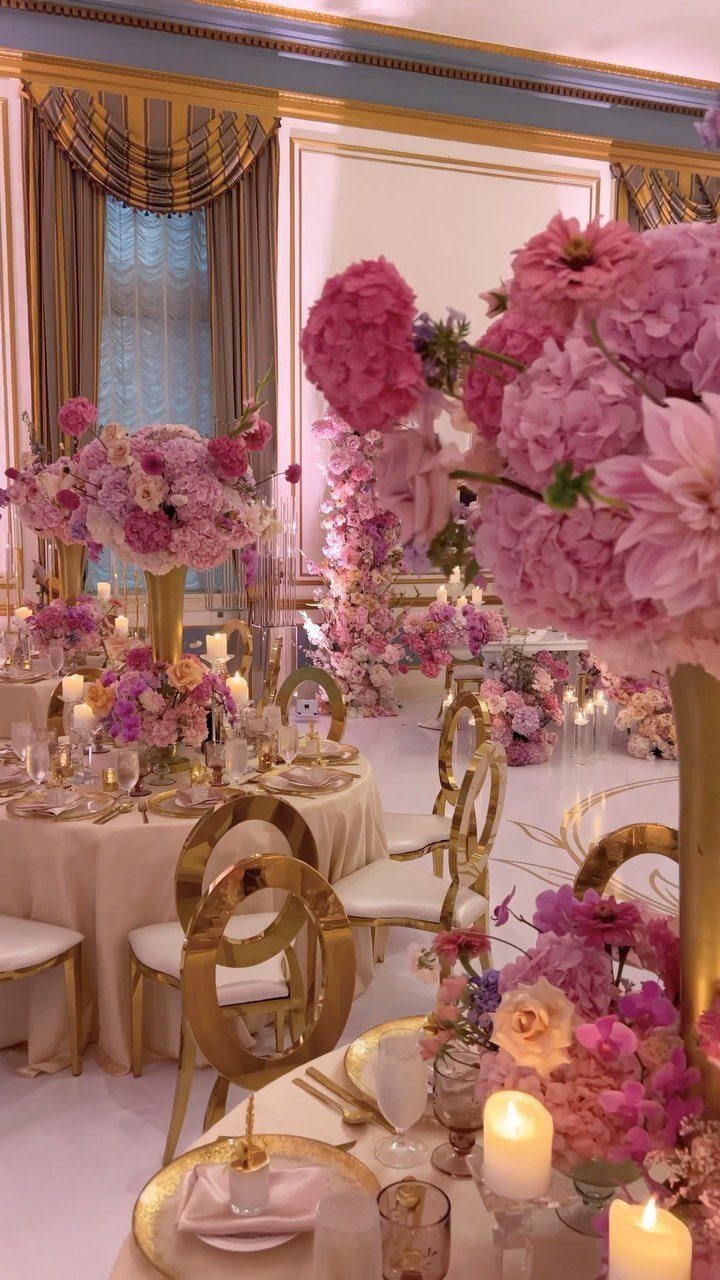
Blush as the body of your floral design and hot pink as the accent lets you keep the romantic base while signaling that the party has started.
This contrast in centerpiece scale works in a ballroom: full, rounded blush arrangements, with hot pink ranunculus tucked in at points where guests will actually sit and talk.
Keeping ceremony colors softer and saving the bolder pink for the reception lets each space have its own mood without fighting.
White and blush for the bridal party and the arch, then the pop of hot pink reserved for tables where people eat and drink. That progression gives the day shape; guests notice the shift without you announcing it.
Gold chairs and candlelight carry the warmth so the hot pink stays lively, not jarring. Ivory ribbon on bouquets, short, keeps the glance downward clean.

Package Include: you will receive 6 artificial rose bouquets, 6 white metal flower pots; Whether you want to create a stunning centerpiece or multiple smaller displays to create a luxurious wedding themed decoration for your table, this set can meet your needs

❤️ Floral Set: This set features a diverse mix of handcrafted flowers, including various types and colors of faux silk and foam blossoms, as well as greenery. Ideal for bridal and bridesmaid bouquets, floral arrangements, table centerpieces, and more.

Size:35" W x 120" L. This versatile runner is designed to fit most tables, chairs, and wedding arches.
4. Pink and Gold
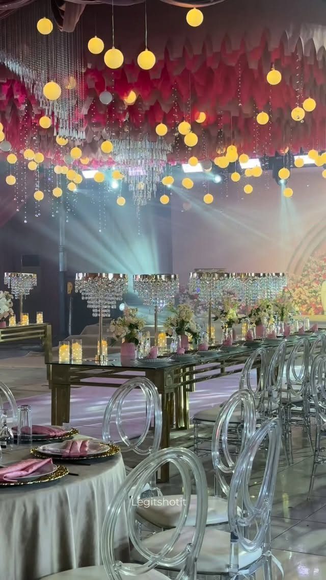
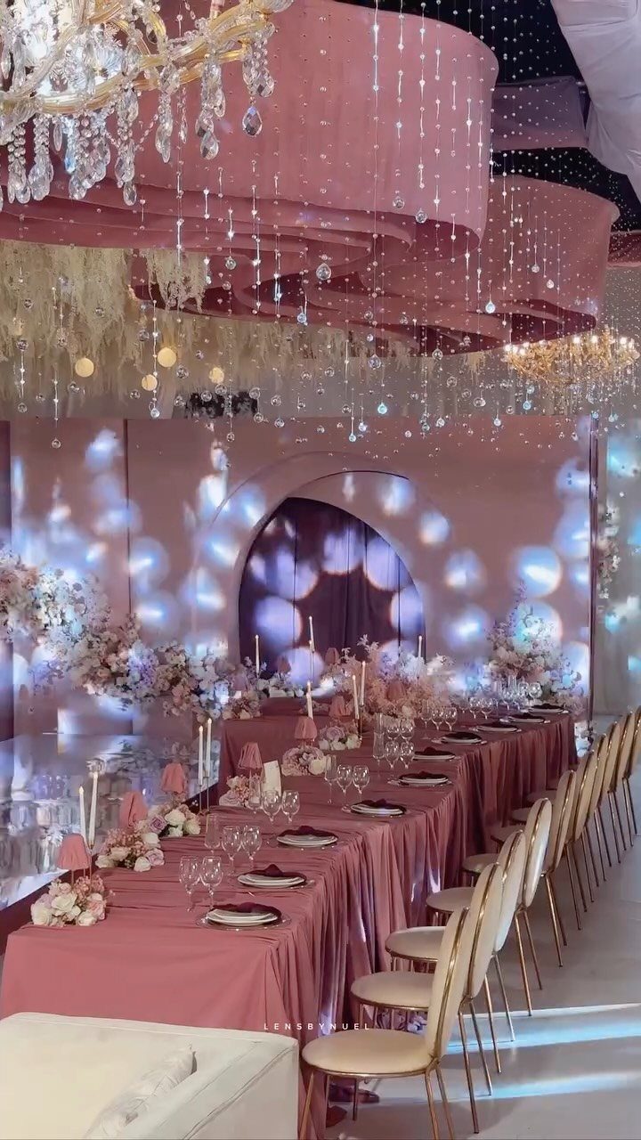
Metallic gold with pink reads expensive because it is, or can be. Clear acrylic chairs let the gold table and pink volume overhead hold the visual weight; nothing competes.
I would not try this in a space with low ceilings or heavy existing decor, since the draped pink ceiling and pendant globes need room to breathe.
The boho note in the background surprised me until I looked again: mismatched bridesmaids’ dresses in the rose and blue family, lavender and burgundy drifting through.
That looseness saves the palette from reading too hotel-banquet. If your crowd leans casual, let the colors wander a little; if formal, keep the gold consistent and the pink single-shade.
Crystal candelabras are non-negotiable here. They ground the metallic surface so it does not read as dessert table.

Heart Design: This charming flower girl wand features a heart-shaped rose arrangement that adds sweetness and elegance to weddings, ceremonies, and photos, making it a suitable accessory for young attendants walking down the aisle
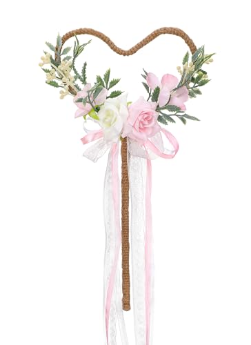
Joyful Atmosphere: Infuse your celebrations with joy and wonder as the wedding wand sprinkles its fairy-like charm, delighting guests of all ages with its playful aura.

Contents Include: This wedding flower crown and wand set includes one foam lace rose flower crown and one matching heart-shaped flower wedding wand. Crafted with elements such as flower buds and rose flower, the lace, and green leaves create a fresh and elegant overall style, suitable for various outfits and occasions
5. Pink and Green
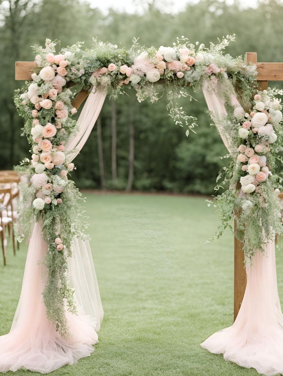
Pink with green works because green is the color that accepts everything, and pink returns the favor by enlivening anything that sits still too long.
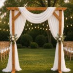
The simplest arch version runs pale fabric drape against pink roses, white roses, and greenery filling the gaps. On a lawn with trees behind, the green extends the frame rather than cluttering it.
Pink-toned bridesmaid gowns against a white backdrop deliver impact without cost; white table linens, white chairs, white tent walls if you have them, with pink and green saved for the living elements that move and change.
Bridesmaids walking down the aisle carry the color; centerpieces on white tables make it pop.
I would add: check your pink under outdoor light before committing. Some pinks turn orange at golden hour.

ONE SIZE: fits all US 0-16; PLUS SIZE: fits all US 18-24

Size Attention: Please refer to the size chart on the pic before ordering

Infinity Bridesmaid Dresses: Convertible bridesmaid dress, convertible design allows wrapping, twisting, and draping the fabric to create different necklines (halter, one-shoulder, strapless, off-shoulder, v-neck, scoop neck)plus size, multi-way dress, twist wrap dress. Convertible multi-way twist wrap dress can be worn and created many different styles for any body shapes for bridesmaids on the wedding prom evening gown
6. Pastel Pink and Light Blue
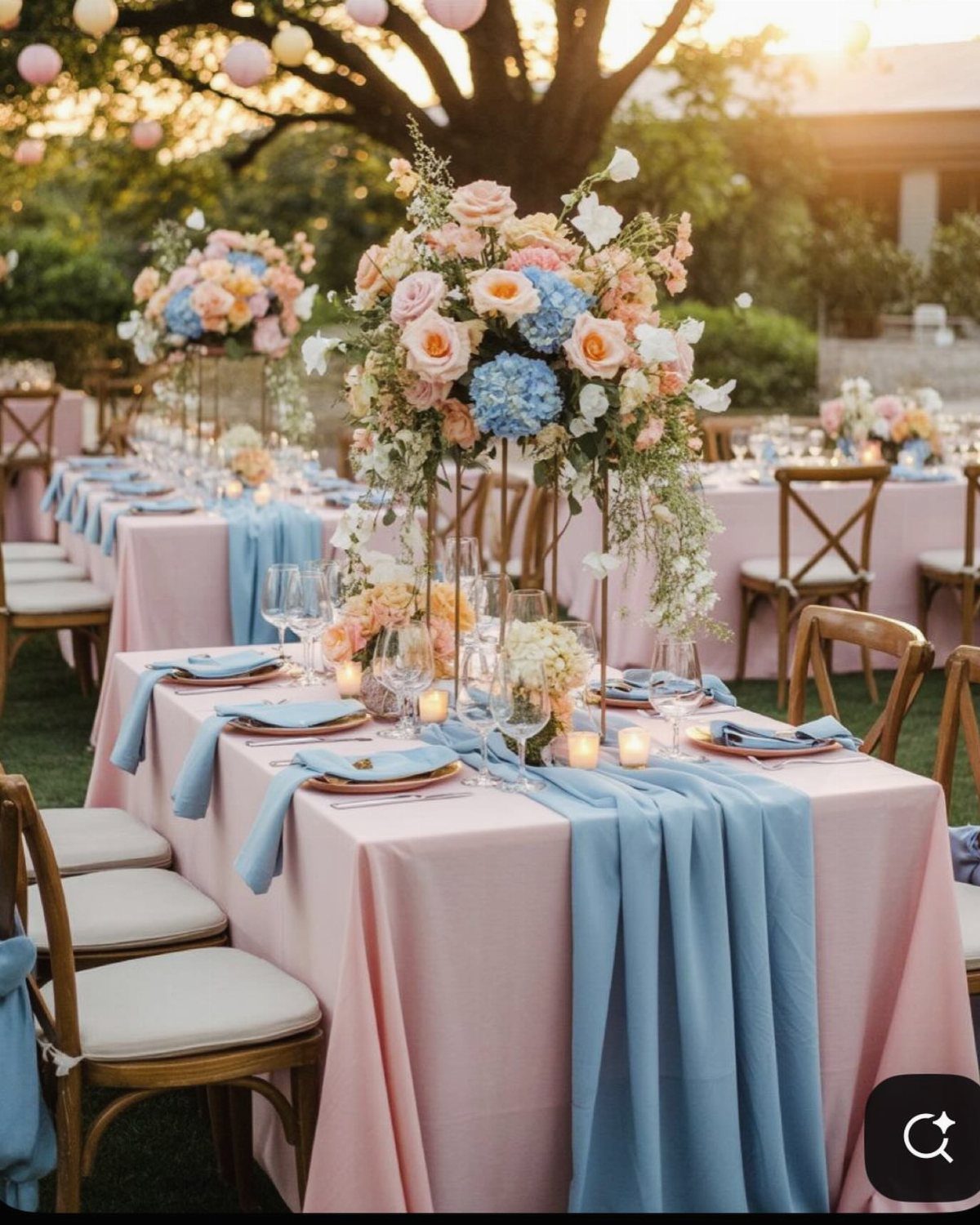
Pastel pink and light blue together summon a certain period pleasure without requiring the full production; the outdoor setup gets there with tablecloths in pink, runners in blue, wooden chairs that ground the fantasy in something touchable.
I would use this for a garden wedding or any tent where guests will notice the coordination across the whole room.
The tall centerpieces carry both colors at once, which matters. Separate pink tables and blue tables would read as 2 weddings sharing space; mixed florals, mixed linens, the same napkin on every chair pull it together.
The notes credit a styled shoot by Virginia pros, which means this level of coherence took planning. Budget for a florist who can source both tones in season, or choose one color for flowers and the other for fabric.
Cross-back chairs suit this palette better than chiavari; their simpler lines keep the look from going too formal. Their simpler line keeps the pastels from turning sugary.

Quantity: 1 Rectangular Tablecloth, Material: Polyester, Color: Dusty Rose, Size: 90"x132", Long Edges Hemmed Seamless 1 pc design

💖【Product Information】The package includes 10 pieces of dusty rose gauze table runners, elegant and good looking design, exquisite in craftsmanship, and the quantity is sufficient for your daily use and replacement needs, which is perfect for home decor, wedding table decorations and party table decorations.

Package Include: you will get 12 pieces 10ft length dusty pink cheesecloth table runner, enough quantity is suitable for wedding banquets and various parties, the size of each table runner is approximately 35 x 120 inches / 90 x 300 cm, which is large enough to cover rectangle and round tables, can also be spliced together for long tables. Even can be used for chair cover sashes or decorative napkins, backdrop draping or even gift wrapping.
7. Blush Pink and Peach
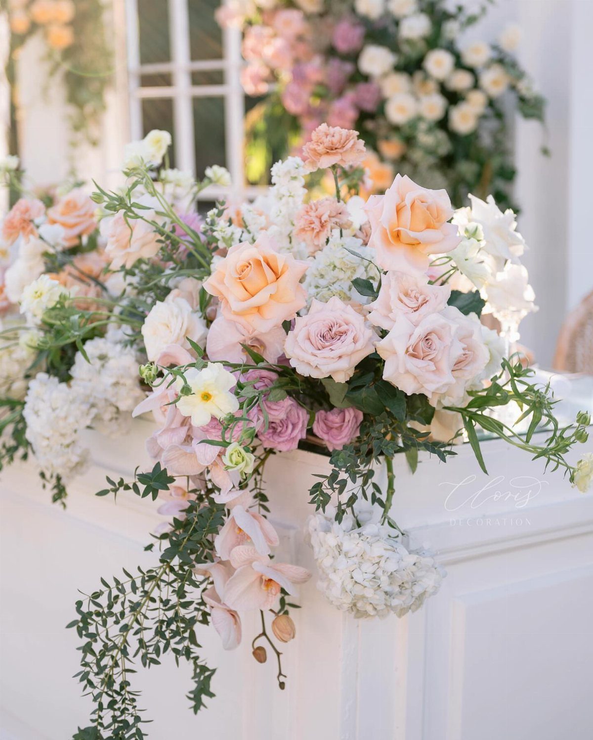
Blush pink and peach merge at the sun-warmed edge of romance, soft enough for daylight, rich enough for candlelight.
The visible arrangement runs roses in both tones against white hydrangeas and scattered orchids; the green foliage does the mixing work so the blooms read as layers of a single warmth rather than 2 colors in competition.
Any season carries this palette, though summer and fall give you the widest peach rose availability.
I would ask a florist to show the exact blush and peach varieties together under your venue’s light before ordering; peach can read orange or coral depending on the source, and neither direction is wrong unless it surprises you.

❤️ Floral Set: This set features a diverse mix of handcrafted flowers, including various types and colors of faux silk and foam blossoms, as well as greenery. Ideal for bridal and bridesmaid bouquets, floral arrangements, table centerpieces, and more.

❤️ Floral Set: This set features a diverse mix of handcrafted flowers, including various types and colors of faux silk and foam blossoms, as well as greenery. Ideal for bridal and bridesmaid bouquets, floral arrangements, table centerpieces, and more.

SQUARE PACKAGING: Box size 11.22"D x 10.24"W x 2.56"H, comes with enough flowers to fuel your creativity, this square box can DIY a medium full enough centerpiece, or 4 small centerpieces.
8. Pink Draped Ceiling Reception
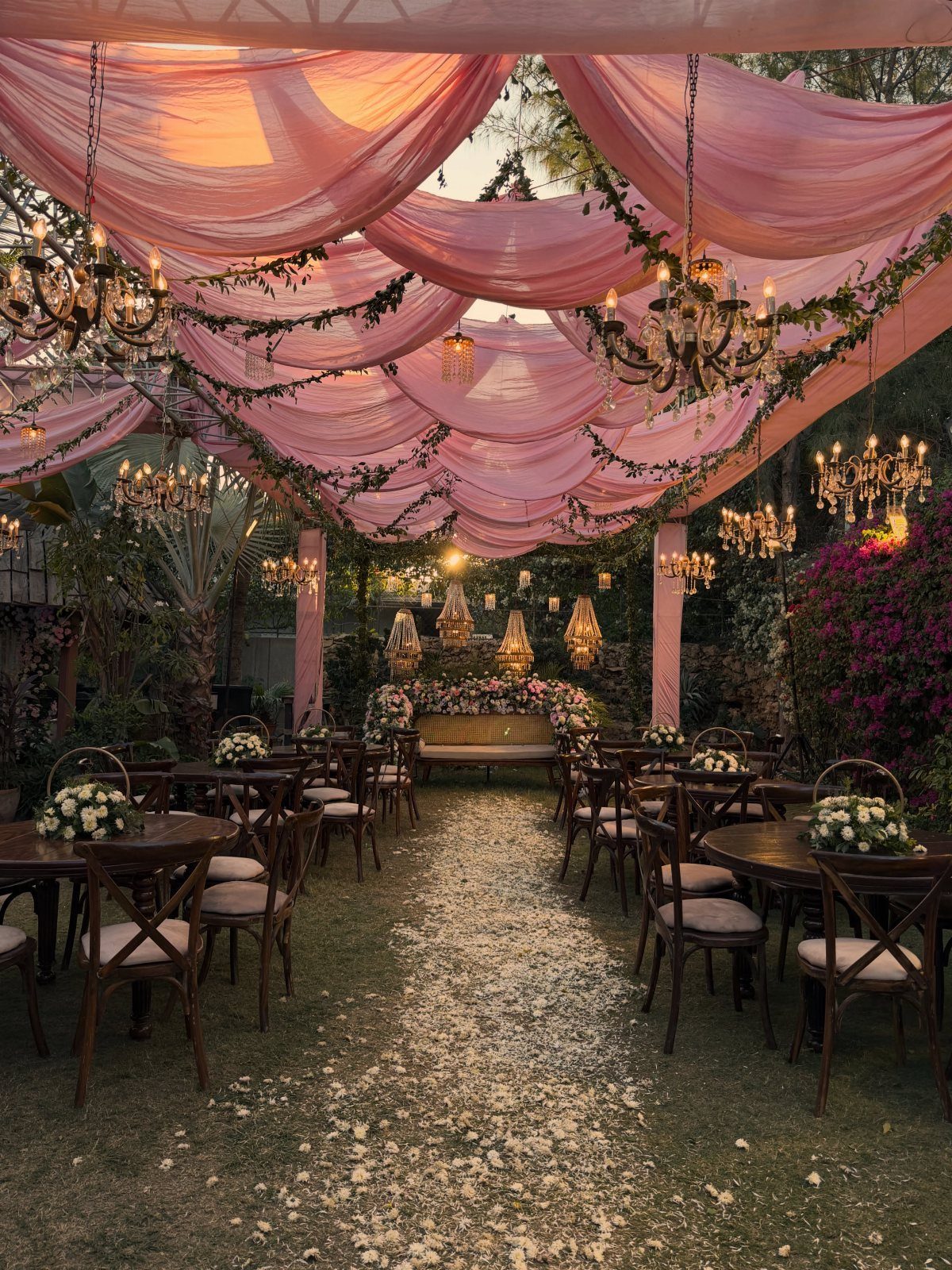
Ceiling drapes in pink turn a tent or open-air structure into a room that already feels like celebration before guests sit down.
The visible setup runs fabric in billowed panels overhead, chandeliers hung at intervals for weight and light, with wooden tables and cross-back chairs below that keep the ground plane honest and unfussy.
This idea trades floor space for height; the poles or frame that hold the drapes matter visually, so budget for the structure as part of the look, not a hidden support.
Chandeliers need power, and their cord runs must be planned before the event, not solved after setup starts.
I would reserve this for a seated dinner rather than cocktail format; the overhead focus rewards looking up from a chair.

PEONY FLOWERS BOUQUET: Each pink peonies artificial flowers bouquet consists of 5 branches, which with 5 big peony flowers, 4 small peony buds, some berries, spikes, grass and leaves. Total bouquet height is approx 12.6"(32CM). Big peony flower heads diameter is approx 2.8"(7CM). Small peony buds diameter is approx 1.2"(3CM). Perfect size of artificial flowers for vase for decorate your home and office

MATERIAL: This assorted faux hot pink rose made of premium soft PE foam, artificial roses replicate the natural texture and lifelike appearance of fresh cut blooms for realistic visual and tactile experience. Petals undergo dyeing process,the transition of fuschia,light petal pink, blush and white color is more natural.Which lend them the look and feel of fresh flowers, will never wilt or fade.
Color Pairings with Pink
Navy with pink shifts the mood from soft to anchored; the pair reads formal without defaulting to black-tie severity.
Taupe, less common than the cream and gold already in the list, sits in the same neutral family but turns the temperature cooler and more modern.
Where cream softens pink into morning light, taupe lets both colors stay understated; the result suits venues with concrete, raw wood, or any industrial element you cannot hide.
Silver accents, mentioned as a pairing for pink generally, work as jewelry-tone hardware on chairs, flatware, or thin-rimmed glassware rather than as a dominant color. They keep the palette from drifting too warm when multiple pinks layer together.

【COMPLETE SET】 - This package includes 60 pcs pink wedding wands bulk, each featuring a wooden stick handle and colorful silk lace ribbons with bells. These sticks for ribbon sticks provide ample quantity for large parties, weddings, or events, allowing you to share with family and friends.

What You Will Get: You will receive 50 wedding ribbon sticks with wooden stick handles, here are four colors for you to choose, decorated with lace and bells sufficient quantity for you to dress up as needed in any occasion; in addition, you can share and use with family and friends

PACKAGE QUANTITY: Includes 40 pieces of pink ribbon sticks. Each unit features a wooden handle, lace trim, and a small bell. Designed for large groups at wedding send-offs, birthday parties, or graduation events
Using Pink in Floral Arrangements
Bouquets are the obvious starting point, but the color carries through boutonnieres, aisle markers, and cake flowers with less effort than a palette that needs dyed elements or painted props to stay coherent.
Green accepts every other color; that is why foliage does most of the mixing work, and the blooms do not have to match exactly.
A florist can source blush, dusty rose, and peach roses from different growers and the greens will still pull them into a single arrangement.

Design Inspiration: Capture vintage romance with dusty rose and mauve decor

Size Tips: Crafted from soft breathable chiffon fabric for a structured fit. Please carefully review the size chart before ordering to select your correct size.

Summer Dress For Women Styles: Elegant spaghetti strap Cowl Neckline slim maxi for women formal dresses. The back is designed with concealed zippers to show off the elegant back line. The dress’s well-designed add dimension and are cut to the mid-thigh slit, Outer layer length to ankle, revealing a flattering leg line when walking