The palettes below move from quiet ivory pairings to sharp navy contrasts, and I have found the simplest filter is whether your wedding runs in daylight or after dark.
Satin, velvet, and sequined fabrics each behave differently under string bulbs versus chandeliers; walk your venue at the hour you will actually use it before committing to any of them.
Gold charges that read jewelry by candlelight can turn beige under fluorescents, and champagne satin that photographs warm on tables may flash pink or yellow on a bridesmaid’s shoulder under flash photography.
1. Champagne Satin Fabrics with Gold Accents
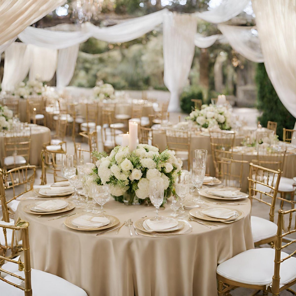
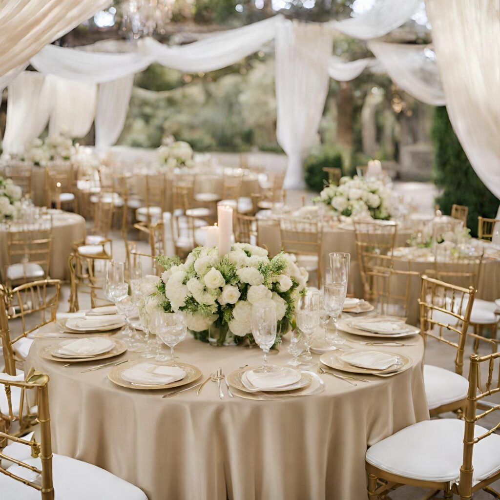
Satin catches light differently than matte linen, and champagne satin in particular turns golden hour into something you can spread across every table.
The fabric has weight; it drapes without pooling, and against gold Chiavari chairs the tone shifts warm rather than yellow.
I would skip the full ceiling drape unless the venue needs it.
The tablecloth alone does the work, and white centerpieces keep the look from feeling too staged. Pampas grass and mocha bridesmaid dresses, if you want them, extend the same range into the party without repeating the exact shade.

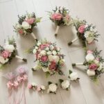
Neutral Floral Base for DIY Arrangements: Designed with soft ivory, champagne and cream tones, this artificial flower combo box works for wedding centerpieces, bridal bouquets, home décor and small event styling.

❤️Material: Floroom Studio's artificial roses are crafted from soft, high-quality PE foam, which lends them the look and feel of fresh flowers.
2. Champagne and Ivory
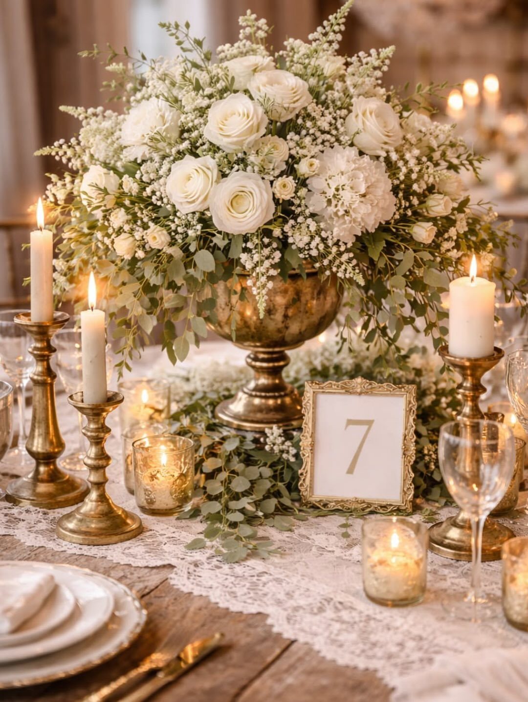
Ivory next to champagne reads as depth rather than contrast: the same family, 2 temperatures.
Lace runners and brass candlesticks keep it from going flat, and baby’s breath, which can look cheap in bolder palettes, here fills space without breaking the mood.
This is the palette I would choose if my venue had dark wood or uneven light.
It forgives. A gold urn will outlast the flowers in any arrangement; estate sales are where I have found the best ones, and most cities have a prop house that rents them by the weekend if buying feels too permanent.
Warm ivory candles, not stark white, seal the tone.

Pack of 1, 27.5-inch width x 120-inch length. It can satisfy your parties and daily use on rectangular and round tables


Elevate your event decor with our 120-inch round crinkle taffeta tablecloth, perfect for weddings, parties, and stylish events. Ideal for modern aesthetics.
3. Champagne and Navy
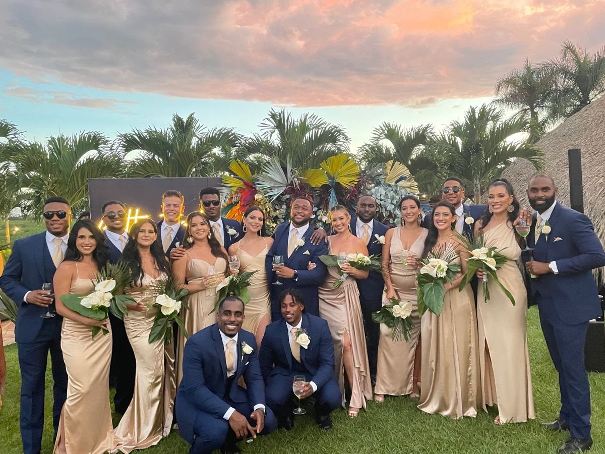
Navy grounds champagne in a way black cannot: it keeps the warmth, just adds gravity.
For tables, navy cloth with gold chargers stacks the same 3 tones. Champagne napkins, not navy; let the linen carry the deep color and the napkin sit light.
Navy roses are dyed white blooms, and they read more purple than true midnight. Spray roses or dahlias hold the shade better than standard roses.

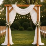
Best Choice Wedding Arch: Sheer arch drapes are good choice for your wedding decor. Romantic arch fabric will help to create beautiful folds or leave it flowing loose onto the floor, adding a very delicate, soft touch. Best wedding decoration gift.

【Wedding Arch Draping Fabric】Package includes 1 panel burgundy sheer drapes, each panel is 28.7 inches wide and 20 ft long. The length of wedding arch draping fabric is long enough to fit different size arch decoration. This polyester sheer drapery backdrop can create a romantic and elegant atmosphere on your party.

Wedding Arch Drapes Material: These drapery fabric panels are made of an unique fabric that has a slight shimmer, they are silky soft and more graceful than tulle or nylon fabrics.
4. Champagne Linens and Burgundy Roses
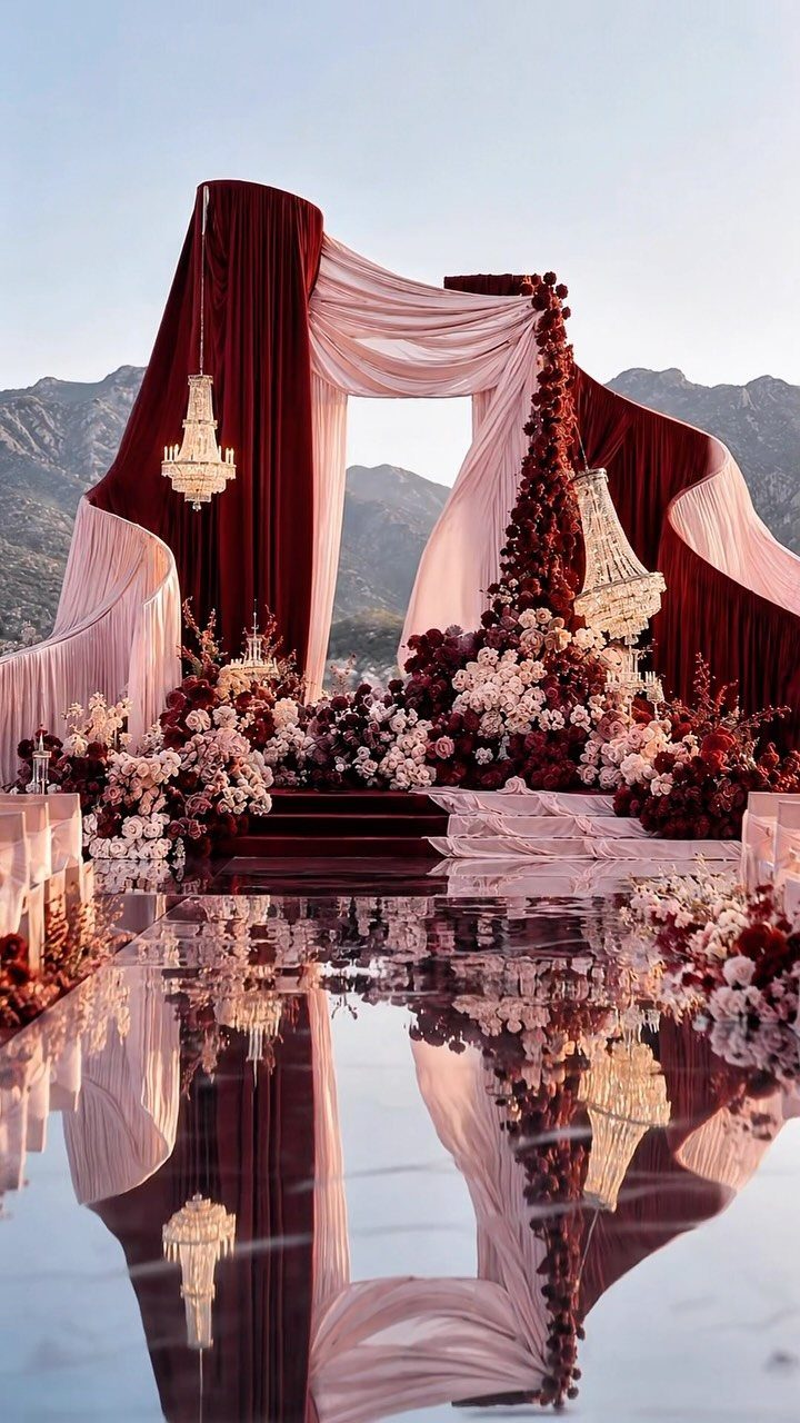
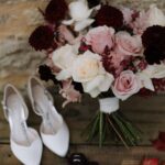
Burgundy and champagne share a weight: neither reads as pastel, neither as primary.
I would copy velvet drapes first if I had a pergola or arbor to work with; they frame the space without competing with what stands in front of them.
Fabric hangs better outdoors than florals alone, and the chandeliers give evening a cut-off moment when they light.
For tables, burgundy glassware against cream linen reverses the balance of the ceremony. Gold chargers bridge the two.
Fall timing suits this best; summer heat would flatten the burgundy. Pampas grass can soften the edges if the roses feel too formal for the setting, and it dries well enough to reuse at home after.

INCANDESCENT LOOK, LED BENEFITS - Tupkee UNIQUELY LED is a new technology LED Christmas lights bulb that perfectly replicates the look and feel of the traditional incandescent bulbs you love, with the same warm, nostalgic glow of classic Christmas lights, but with all the benefits of LED: energy-saving, cool to the touch, and a longer-lasting shine. You won't be able to tell the difference, bringing the best of both worlds, the timeless look of old-fashioned lights with modern efficiency!

DURABLE OUTDOOR STRING LIGHTS: LYCKLIG globe string lights are 19 feet long with bulbs spaced 4 inches apart.This fairy lights use only 0.09 watts per LED bead, saving 80% more energy compared to traditional bulbs, thus making the light string longer life. In addition, Our christmas fairy lights use a parallel circuit design, ensuring that if one bulb is damaged, it won't affect the others,we provide 2 spare fuses and 2 extra bulbs for your convenience in case of replacements.

DUET LIGHTING DESIGN This set of 50 Champagne LED twinkle Christmas lights alternates between C6 1-inch faceted bulbs and 5mm conical bulbs. The smaller 5mm bulb provides focused brightness, while the larger 1-inch C6 bulb offers broader, fuller illumination. Together, they create a unique and eye-catching decorative effect, perfect for any setting.
5. Black Tuxedos with Champagne Dresses
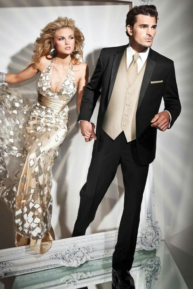
The vest and tie matching her dress is the detail that makes this work.
Without it, he reads as generic formal and she as solo statement. Champagne patterned fabric, not plain, adds texture that photographs well against black without competing for attention.
I would ask groomsmen to carry the same champagne in a tie or pocket square, not the vest.
Too much match and the party looks like uniformed staff. Keeping bridesmaids in white bouquets and tables to greenery with white candles carries the same restraint through both sides of the room.

Comfort & Inner Lining: Crafted from premium polyester with a skin-friendly soft lining, this sparkly top ensures full coverage and irritation-free comfort. Perfect as a wedding guest top or holiday party outfit, the inner layer provides a smooth barrier against sequins, allowing you to shine all day
❤️Material: Floroom Studio's artificial roses are crafted from soft, high-quality PE foam, which lends them the look and feel of fresh flowers.

【Realistic Roses and Gypsophila】 - Champagne roses are full and beautiful,layers of petals make the flowers look like more real. Gypsophila is hidden in the green leaves, adding bright spots to the garland. It sets off the rose, but it also embellishes the flower Garland.
6. Blush and Champagne Bridesmaid Dresses
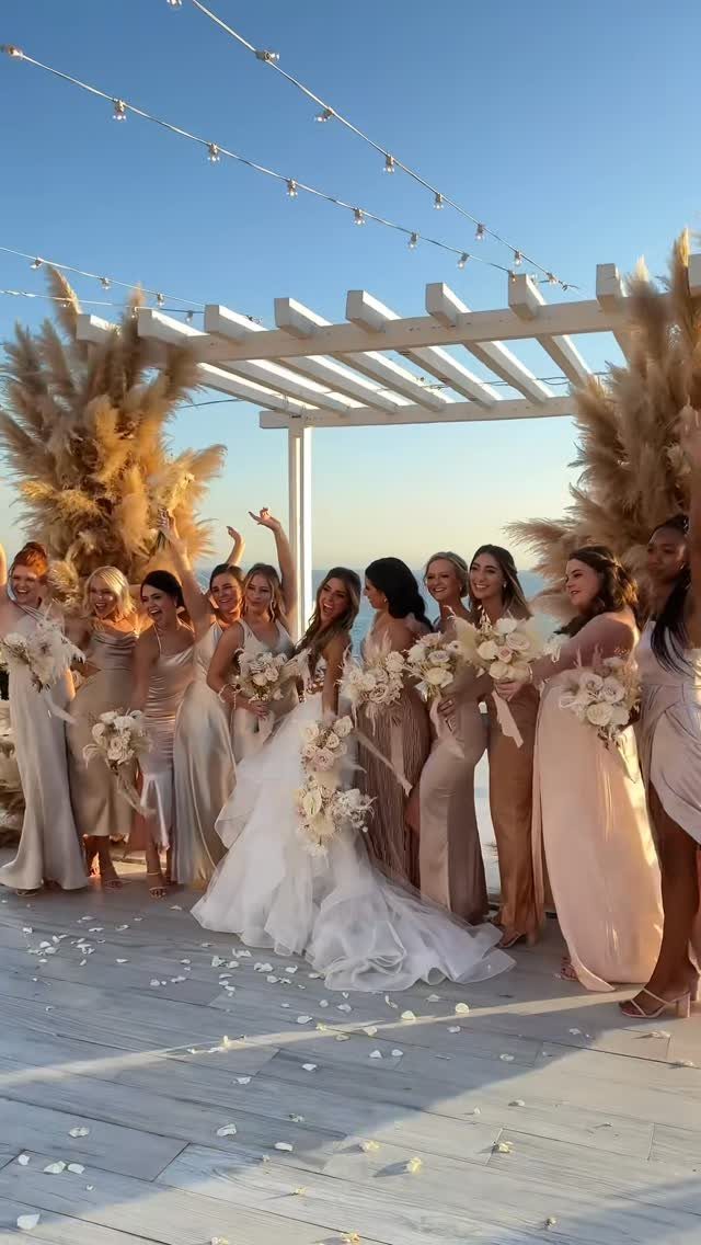
Varied dresses, same family: the bride in white stands apart without a color clash. The varied tones mean each bridesmaid can wear what flatters her, and the group still photographs as a set.
Silk linens and crystal chandeliers, if your venue has them, push this toward formal.
Sequined dresses are a harder sell for daytime. Pampas grass and mocha would warm the palette further, though I would keep ceremony flowers cream rather than matching the dresses so closely they disappear into each other.

Dense Sparkle That Isn't See-Through — High-density sequins cover every inch of this navy blue table runner, so it catches the light beautifully without letting your table show through. The 12x108-inch size drapes a 6ft or 8ft rectangular table with a clean, elegant finish — no need for a second layer underneath.

Material: 100% polyester, stain & wrinkle resistant. , 1pc design. Thickness: 200gsm (grams per sqaure meter). Weight on this is heavy.

Elevate your special event with our 90 x 156 inch champagne crinkle taffeta tablecloth, perfect for 8 ft rectangular tables. Ideal for weddings and receptions.
7. Champagne Linens and Cream Flowers
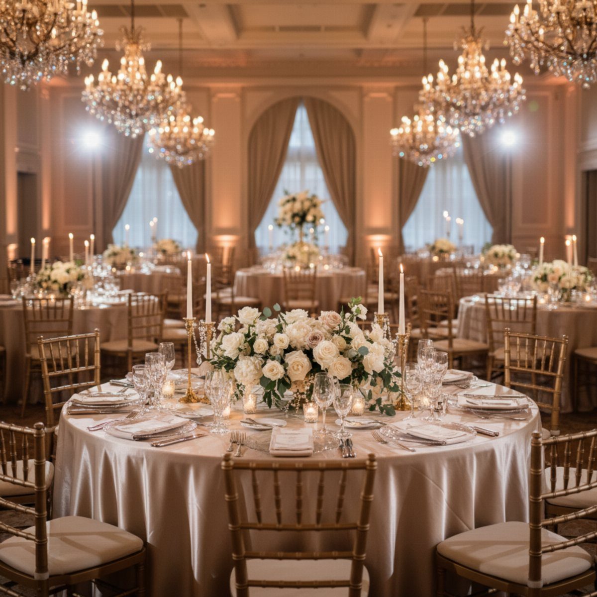
Cream roses against champagne satin read as texture, not contrast. The satin carries the light and the flowers absorb it, so the room stays soft even under chandeliers.
Low centerpieces keep sight lines open: cream ranunculus or garden roses, no greenery that would introduce a cooler tone.
White taper candles in glass holders add height without color. Gold cutlery, not silver, keeps the metal in the same family as the linen.
I would pick this exact pairing for a ballroom, or anywhere the light already hits crystal and bounces. It asks nothing of the architecture; it flatters it.

Size: 2 panels burgundy red sheer drapes, 240" L x 31" W, long enough for your fall indoor and outdoor events decorations.

Condition: Brand New Quantity: 1 pc Material: Ice Crushed Velvet Size: 10 ft Height x 57 in Width Rod Pocket Size: 4 in (Rod pockets on both ends) Edges: Hemmed Care: Machine wash with cold water. Machine dry at low temperature or hang dry, and remove as soon as the cycle is complete.

LUXURIOUS VELVET FABRIC:Crafted from high-quality,ultra-soft stretch velvet with a rich luster and sophisticated drape.The floor-length silhouette combined with a sexy surplice V-neck makes this gown a timeless masterpiece for your formal collection.
Color Combinations
Champagne against ivory reads flat without something metal in between. I would add gold cutlery or a brass candlestick to every table that uses both; the eye needs a hard surface to rest on.
Blush and champagne risk muddying each other if the pinks turn coral.
Sample the pair in daylight before committing. Navy and champagne need no such test; the contrast is structural, not tonal, and holds under any venue lighting.
Burgundy rental napkins are easy to add late; discovering the balance is off during setup is not.
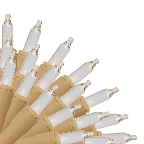
18" Lead wire x 4.25" spacing x 3.5" End Connect, Total Length Approx 19.15 FT Max Connect: 10 Sets Set Wattage 20.4 W Suitable for Indoor/Outdoor Use Brite Star has been...
Decor Elements
Gold accents matter most where they catch actual light.
A gold charger under low banquet fluorescents reads beige; under chandeliers it reads jewelry. Walk your venue at the hour of your reception before you rent.
Silk linens carry champagne color more faithfully than polyester, which can flash pink or yellow depending on the dye lot. Ask for a swatch and photograph it in your venue light, not just your kitchen.
Crystal glassware does more than gold for a champagne palette if your budget forces one choice.
The glass refracts the tone of the linen underneath; gold sits there and competes with it. Sequined anything needs distance.
Up close the sparkle fractures the soft palette you paid for; from across the room it reads as shimmer. I would not use sequined linens on tables where guests sit closer than 6 ft to each other.

❤️Material: Floroom Studio's artificial roses are crafted from soft, high-quality PE foam, which lends them the look and feel of fresh flowers. ❤️Perfect for DIY:...
Seasonal Themes
Spring and summer champagne weddings need one cool element or the warmth flattens in outdoor light.
Ivory plates instead of cream, or silver instead of gold cutlery, give the eye that cool contrast. Autumn timing suits burgundy and champagne because the surrounding foliage already provides it; the palette borrows from the season instead of fighting it.
I would move that pairing to September or October, or substitute mocha for burgundy if June is fixed.
Pampas grass works in any season but reads freshest in late summer when its natural color matches. Forced bleaching in March turns it stiff and uniform.

PREMIUM SATIN FABRIC: Elegant satin table runner 12 x 108 inch made from smooth, high-quality polyester satin fabric with a luxurious sheen that enhances wedding receptions, banquets, parties, and special events. Durable, wrinkle-resistant, and designed for repeated use.
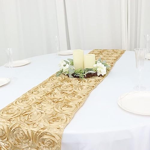
✨IMPRESS YOUR GUESTS – Our wedding rosette satin table runners will be the memorable decorative accent of your special day.

Enhance your event's elegance with our 132 inch round crinkle taffeta tablecloth, perfect for weddings, parties, and special occasions. Stylish and eye-catching.
Bridesmaid Attire
Satin in champagne photographs differently on bodies than on hangers.
The drape follows weight, not size, and pulls across the back differently after an hour of sitting. Budget a longer fitting than you would for crepe or chiffon.
Taupe and hazelnut extend the same family for varied dresses without losing cohesion.
I would give each bridesmaid a swatch and two fabric options, not one. The same shade in matte versus sheen reads as 2 different colors under photography flash.
Azazie lists bridesmaid dresses starting at $69 in this palette, with extended sizing. Long satin gowns in complementary shades, not identical, let the bride stand apart without anyone wearing a color they cannot stand.
Frequently Asked Questions
What colors go with champagne for a wedding?
Champagne pairs with blush, ivory, gold, navy, and burgundy, each giving a different mood.
Ivory and gold keep the palette warm and formal; navy adds weight without turning cold; burgundy suits fall and shares the same depth. Blush works too, though it can muddy toward coral if the pink warms too far.
What are the best color combinations for a wedding?
Blush and champagne, champagne and gold, and champagne and navy rank among the popular pairings.
Champagne pairs well with ivory or burgundy, and the better fit depends on your venue lighting and the season you are getting married in. Navy and champagne contrast strongly enough to read clearly under any light, indoors or out.