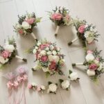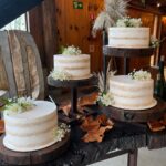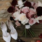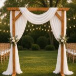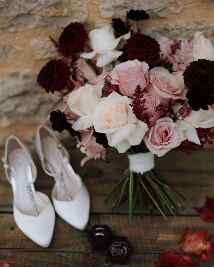
These palettes stretch from peach and green at the gentle end to emerald, black, and champagne where the mood turns formal, and the choice between them depends on whether your guests will be eating cake under chandelier light or leaving while the sky still holds color.
Evening receptions where candlelight does the real work need colors that absorb and reflect flame, like emerald with champagne roses against dark settings; afternoon ceremonies in fading grass, on the other hand, do better with muted tones that meet the light rather than competing with it.
I still start from a heavy burgundy lean toward blush, maybe 60/40, then shift the balance after I see the linen swatches under the actual light I’ll have, since October dusk catches most couples off guard.
1. Burgundy & Blush
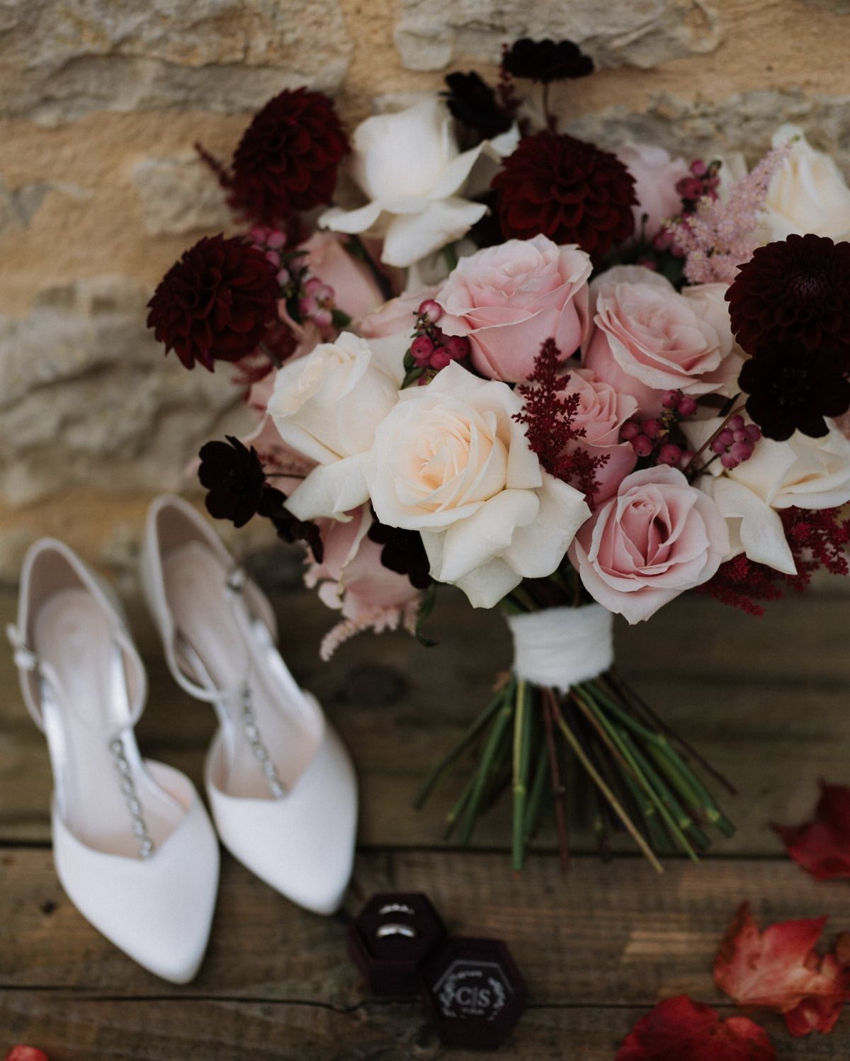
Burgundy and blush softened with cream is the palette I see most often on real fall tables that still look romantic rather than rustic.
Burgundy needs blush to keep it from swallowing a room, and blush needs burgundy to hold any autumn weight at all; I aim for roughly two parts wine to one part pink, then adjust once I see the linens in real light.
I would start the flowers at 60/40 burgundy to blush, then add cream linens or a cream runner to open up the table.
Copper candleholders or thin copper frames on signage catch the late-afternoon light without adding another competing color, something I noticed works better in October when the sun sets earlier.
Deep colors, like a rich plum and beautiful burgundy, are bound to warm up any crisp fall evening.

Package Include: you will get 12 pieces 10ft length burgundy cheesecloth table runner, enough quantity is suitable for wedding banquets and various parties, the size of each table runner is approximately 35 x 120 inches / 90 x 300 cm, which is large enough to cover rectangle and round tables, can also be spliced together for long tables. Even can be used for chair cover sashes or decorative napkins, backdrop draping or even gift wrapping.

Package: Contains cotton napkins for table decor.

Flame Retardant Excellence: Crafted with IFR (Inherently Flame Retardant) polyester, our tablecloth ensures safety without compromising style, making it perfect for events, weddings, and restaurants.
2. Cinnamon Spice Wedding Color Palette
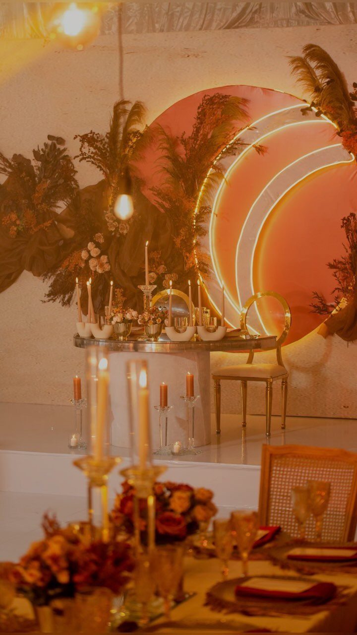
Cinnamon spice runs warmer than standard orange-and-red fall palettes because the toffee and plum notes pull everything toward brown rather than traffic-cone bright.
That matters if your venue has wood floors, brick walls, or any surface that already contributes its own orange.
Dried florals hold the cinnamon and terra cotta tones better than fresh flowers do over a long reception, which is worth knowing if your setup starts in early afternoon.

Natural Potpourri Blend for Home Decor A carefully curated potpourri mix made from real dried flowers, fruits, and spices, designed to enhance bowls, trays, jars, and decorative displays.

Multipurpose Kitchen Staples: Sleek, modern Glass Spice Shakers with versatile lids for a clutter-free kitchen. Ideal for storing and dispensing Parmesan, sugar, spices, and more.

Enchanting Fragrance: our christmas spice candle is ideal for women's gift and is the essence of a cozy christmas; It combines cinnamon, spices and enchanting fragrances to create a cozy christmas atmosphere
3. Gold and Burgundy
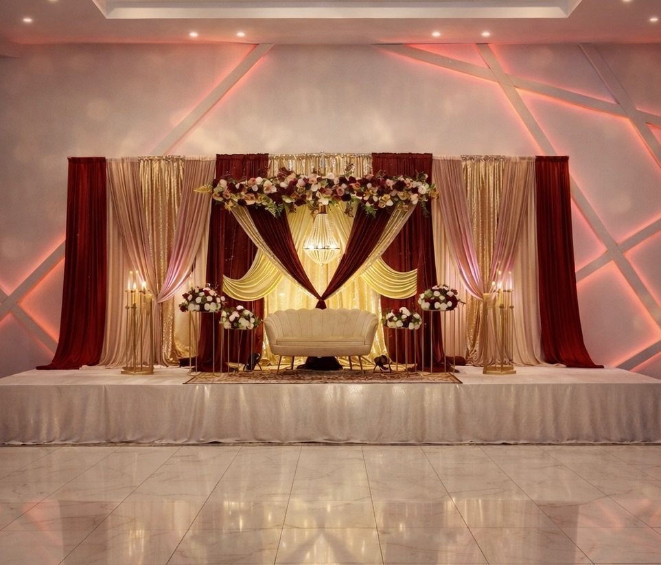
Gold and burgundy is the palette that gets mentioned first when I ask venue coordinators which fall combinations photograph well in their permanent lighting.
The gold reads as warmth and reflection rather than as a color competing with the flowers, which is why it works in spaces with lower ceilings or limited windows where other palettes can feel heavy.
I would use gold-rimmed chargers and polished flatware rather than full gold plates, which can tilt gaudy under reception lighting.
Tall centerpieces with red dahlias, white roses, and dark greenery give the height this palette needs; without vertical elements, burgundy tables can feel like a dark pond.

DISTINCTIVE BURGUNDY+GOLD DESIGN -- Giving a Gorgeous But Timeless Look: We chose to add gold to the top of the burgundy cup body to add a sense of sophistication, perfect for burgundy and gold-themed decoration. Mercury speckled effect on the votive candle holders will enhance the natural warm light of candles, keep shining in your life.

Set Package: 50pcs Elegant Table Place Setting Thank You Cards and 50 Pcs Burgundy Chiffon Ribbons

Elegant Design: Crafted from soft velvet with gold foil lettering, these reserved chair signs bring a luxurious and refined touch to wedding ceremonies, church pews, or formal events.
4. Navy Blue and Terracotta
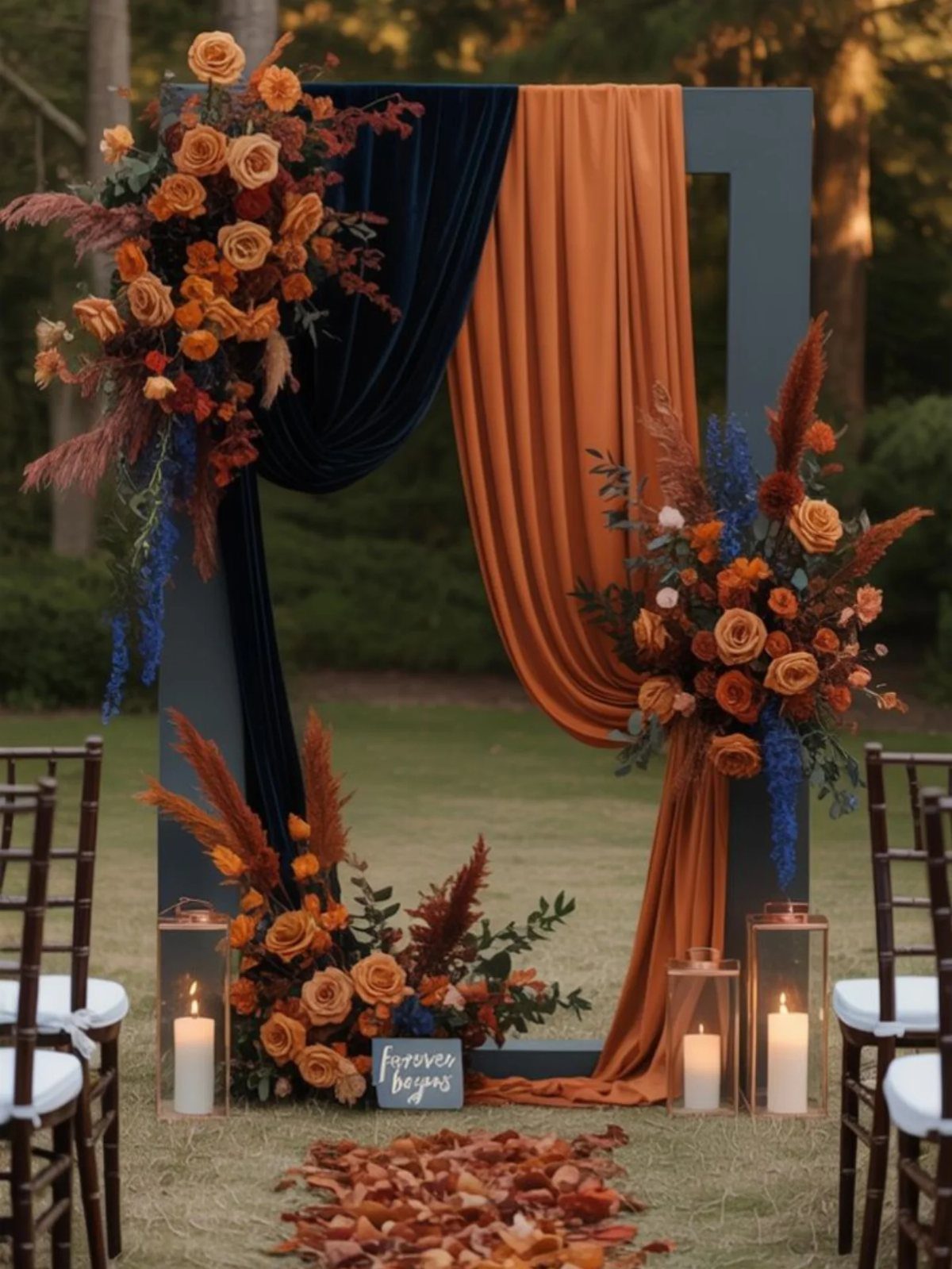
Navy blue and terracotta solves a problem I have seen at several outdoor fall weddings: the sky goes grey, the ground is already brown, and the whole color scheme collapses into mud.
Navy stays legible in flat light, terracotta connects to the season, and the orange accent keeps it from reading as a nautical theme that took a wrong turn inland.
Slate-leaning blues with grey suits or blue and grey tuxedos keep the wedding party looking tailored rather than costumed, and silver-rimmed chargers add the last polish that frames the plates without introducing a fourth color.
This one suits an afternoon ceremony that may run into dusk.

High Quality & Durable : Made of 100% spun polyester with strong stitching, soft and durable to protect your table surface from hot pans, scratches and spills.

PREMIUM SATIN FABRIC: Elegant satin table runner 12 x 108 inch made from smooth, high-quality polyester satin fabric with a luxurious sheen that enhances wedding receptions, banquets, parties, and special events. Durable, wrinkle-resistant, and designed for repeated use.

You Will Get: 30 pcs table number cards with number 1 to 30, 30 pcs green silk bows and 30 pcs gold metal holders, 90 pcs in total. A complete set for wedding reception and banquet layout
5. Yellow Accents Wedding Color Palette
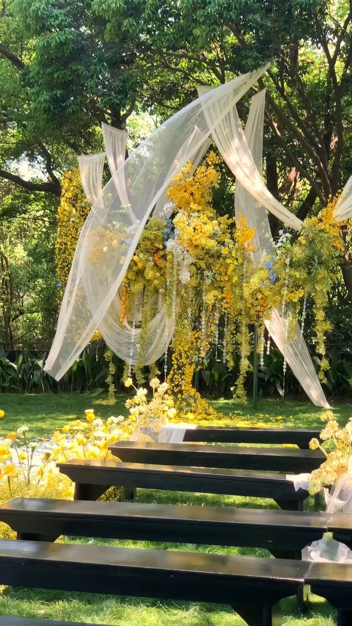
Yellow accents work best as punctuation, not as the sentence itself.
I would put yellow in the flowers at the altar, in confetti or petal tosses, and in small accessories, then ground everything with brown or black for the larger rentals: chairs, linens, the structure of the space.
That way the yellow stays bright rather than tipping into school-bus territory, which happens fast when it covers too much surface.
Blues pair well with yellow for a rustic thread, but I would keep the blue muted and dusty rather than primary if the wedding is indoors; electric blue and bright yellow together read summer fair, not autumn vow.
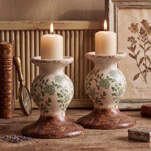
Rustic Sculptural Terracotta Candle Holders: you will received 2 pcs farmhouse pillar candle holders featuring a vintage floral pattern and distressed rustic finish, designed to elevate farmhouse and vintage style home decor

Unscented and Smokeless - Our 10 inch orange taper candles are completely fragrance-free, creating a calm, tranquil atmosphere. Crafted from premium candle wax, these candles burn with a steady, clean flame. Perfect for sensitive guests, this 12 candle pack ensures your terracotta decor stays pristine without unwanted scents or smoke, making them ideal for any indoor setting or home improvement project.

Elegant Terracotta Home Decor — Premium 12 inch terracotta taper candles in a beautiful 4 pack instantly elevate your living room, dining table, and party tablescapes. The warm earthy tone adds a stylish pop of color to mantels, shelves, and accent pieces — perfect for modern and boho home decor lovers.
6. Emerald, Black, and Champagne
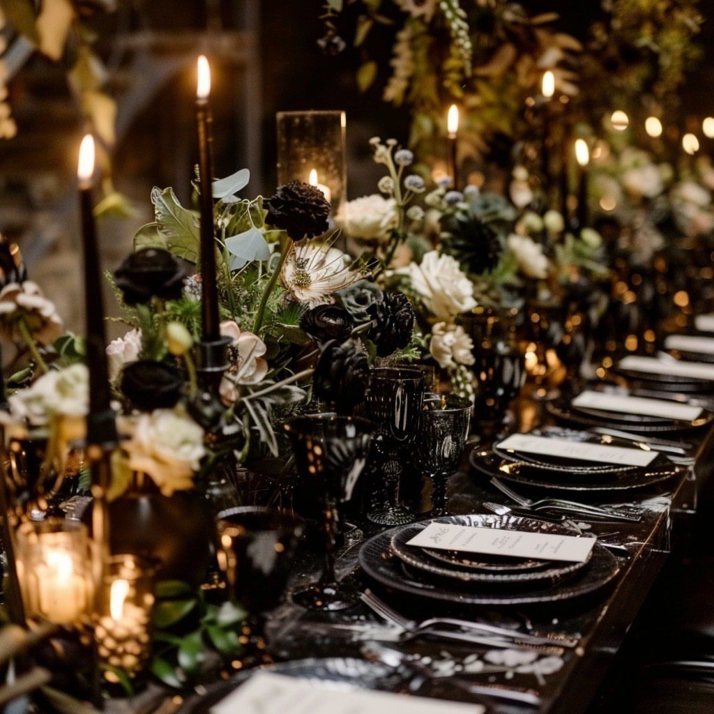
Emerald, black, and champagne is the palette I would choose for an evening reception where candlelight does the real work, because the colors exist mainly to absorb and reflect that light rather than to stand on their own.
Black plates and goblets with emerald linens and champagne roses create a table where the flowers almost glow against the dark settings.
The risk is funereal, which is why the champagne matters: it needs to appear in the florals, in the cake details, and in the metallic accents, not just as a vague concept.
Tall taper candles in black or gold holders, clustered with pillar candles among deep greenery, give the height and flame that keep the room from feeling like a sealed box.
This one trades away the soft, welcoming feeling of afternoon light for something more deliberate and theatrical; I would not use it for a morning or brunch wedding.

Size: 29" W x 120" L. Please allow tiny color difference due to different screens.

Elevate your event decor with our 120-inch round crinkle taffeta tablecloth, perfect for weddings, parties, and stylish events. Ideal for modern aesthetics.

Package Include: You will get 12 pieces Wine Red cheese cloth table runner, enough quantity is suitable for wedding banquets and various parties; The size of each cheesecloth table runner is approximately 20 x 120 inches/55 x 300 cm, which is large enough to cover rectangle and round tables.
7. Burnt Orange and Dusty Blue
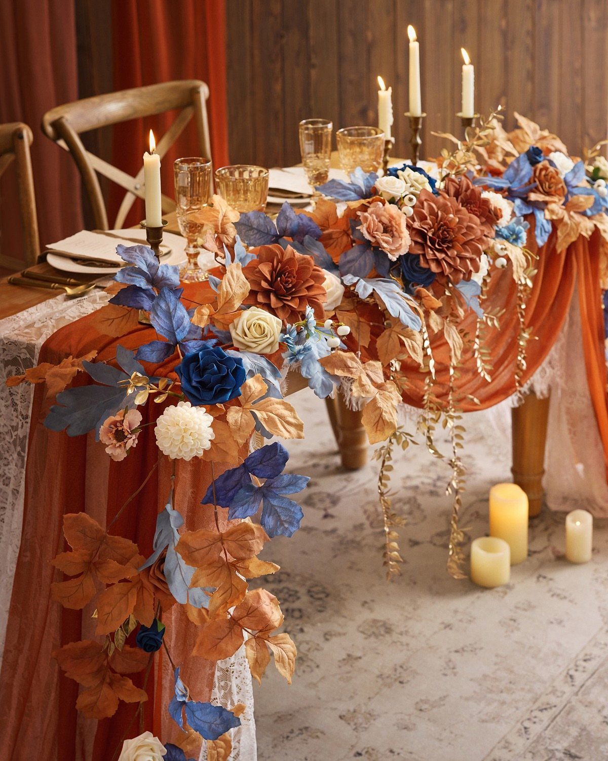
Burnt orange and dusty blue is the pairing I would use for a barn or farm table where the wood grain is part of the decor, because the 2 colors meet the wood without fighting it.
The dusty blue keeps the orange from tipping into Halloween territory, and the orange keeps the blue from drifting toward winter.
I would use the dusty blue in linens and bridesmaid dresses, then concentrate the burnt orange in the florals and any draped fabric so the warmth stays where the light hits it.
Brass vases catch both colors better than silver would, and amber glassware links them without adding a third distinct hue. This one needs natural textures; polished surfaces make the contrast feel accidental rather than chosen.

Mercury Glass Votives: Illuminate your space and immerse yourself in the warm glow of our 24pcs burnt orange candle holders. These candle holders, with their vibrant color and elegant inner mercury coating design, have the ability to glitter and cast incredibly beautiful projections on your tabletop in the darkness. Let their presence light up your gatherings and create an immersive experience for all.

Exclusive Seamless Design: This lace runner is a beautiful seamless one piece design.Made of 100% fabric polyester, Lace knitted craft, sewing on the edge with the soldering iron, exquisite edges, not easily loose thread

✅𝗚𝗥𝗘𝗔𝗧 𝗩𝗔𝗟𝗨𝗘: Pack of 30 Scented or Unscented Tealight Candles, Classic 1.5 Inch Round Silver Tins Are Perfect for Table Centerpieces, Floating Decorations, Dinner Parties, and Even as Emergency Lights
8. Peach and Green
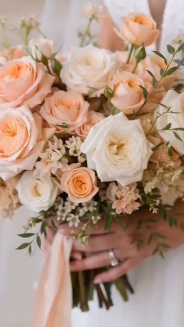
Peach and sage green reads as a deliberate late-season choice rather than a leftover summer palette if the peach leans toward apricot and the green carries enough gray.
I would use this for an outdoor ceremony where the trees are still holding some color but the grass has faded, because the muted tones meet that light rather than competing with it.
The peach belongs in the bouquet and small details; sage covers the larger areas like chair sashes or table runners so the green anchors the space and the peach stays bright.
Cream candles and raw wood tables keep it from feeling too sweet, which is the risk when both colors are soft.
This one sacrifices the high contrast that photographs well at dusk; it is better suited to afternoon light where the colors can be subtle and still read.

High Quality & Durable : Made of 100% spun polyester with strong stitching, soft and durable to protect your table surface from hot pans, scratches and spills.
9. Classic Plum Purple and Grey
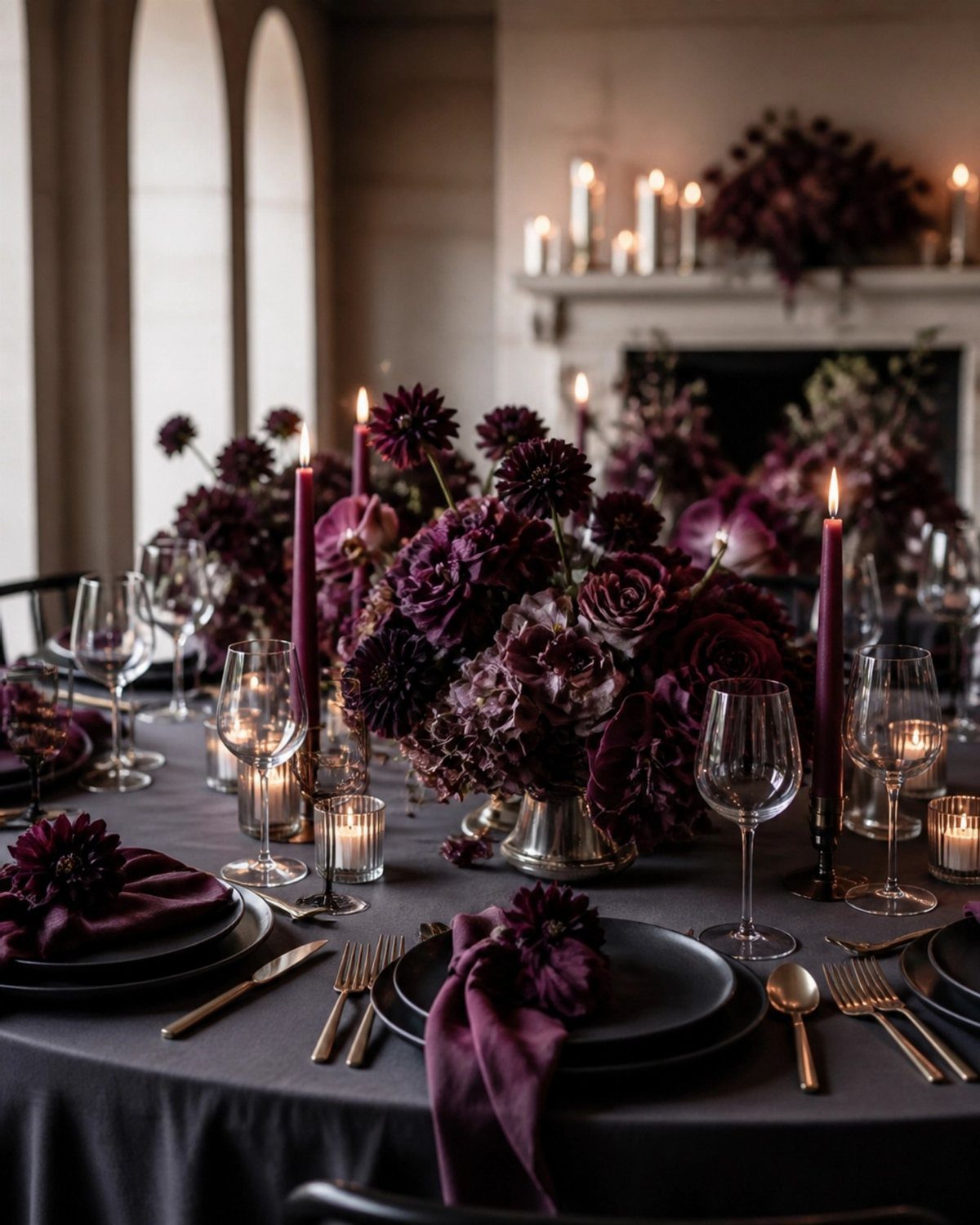
Plum purple and grey is the palette I would suggest when a couple wants formality without the black-tie severity of black and white, because the plum carries weight and the grey keeps it from reading as a spring lilac.
Dark grey table linens with plum napkins and matte black plates create a table where the flowers do not have to carry the entire color story.
I would keep the florals in the deep purple range rather than mixing in lighter shades, and let the champagne or ivory appear only in candlelight and maybe the cake detailing; too much light color breaks the mood this palette builds.
Silver or pewter flatware works better than gold here, since gold warms the plum toward burgundy and the point is to stay in the cooler, more restrained register.
This one suits an evening reception or a venue with existing dark wood and stone.
10. Mustard and Burnt Orange
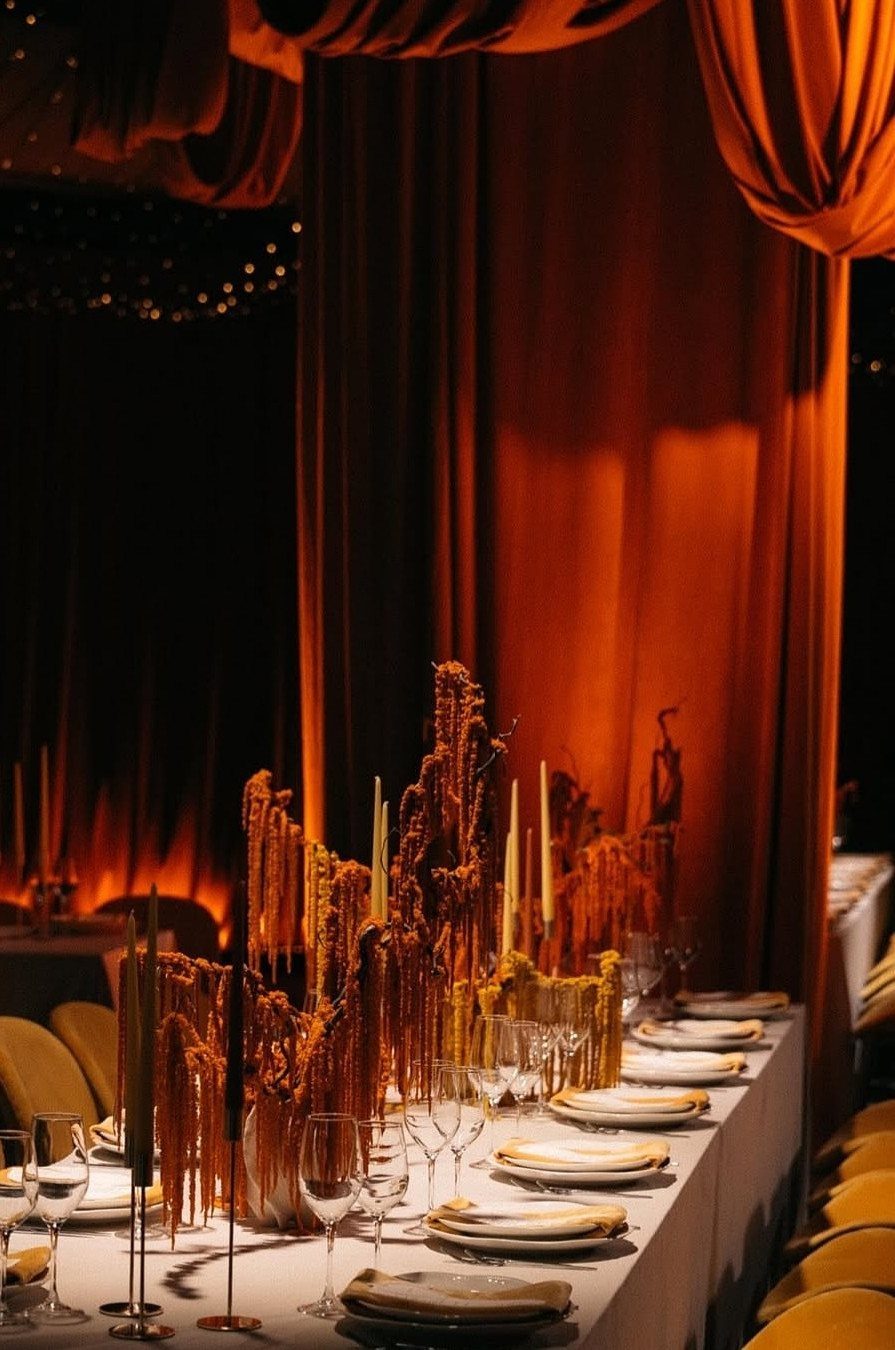
Mustard and burnt orange draws from the same sunset logic as the cinnamon palette but pushes further into saturation, which works when the venue has enough space and light to absorb that much warm color.
I would use mustard in the smaller pieces, napkins and maybe lounge seating, then let burnt orange carry the florals and any drapery so the deeper tone frames the room and the lighter one moves through it.
White plates and clear glassware are essential here; colored china would compete rather than rest the eye. Tall candles in cream or pale gold add vertical points that break up the horizontal bands of warm color.
This one trades away subtlety for atmosphere, and it needs a couple comfortable with being noticed; in a small room it can feel like eating inside a pumpkin.
Choosing Cohesive Colors
A palette only looks intentional when warm and cool tones both have jobs.
I ran into trouble once with a table that was all burgundy and wood; the photograph flattened everything into one dark mass because nothing pulled against the warmth.
A slate napkin or a dusty blue runner would have carved out space for the eye to rest.
I repeat colors in pieces guests actually handle: the menu card, the escort card, the striped straw in the cocktail.
Those small touches do more to unify a room than matching bridesmaid dresses, because guests see them up close and in sequence.
Texture carries color differently than flat paint does.
Velvet reads deeper, satin reads brighter, and raw linen mutes whatever sits on it. I test fabric swatches under venue lighting before I commit, since the same burgundy jumps on velvet and sinks into cotton.
Seasonal Flower Choices
Dahlias, ranunculus, and mums are the flowers I see holding saturated autumn color through a long reception.
Dahlias especially bridge the gap between summer and fall palettes; their structure is formal enough for a seated dinner but the color range runs true orange to near-black burgundy.
Seasonal greenery does more than fill space. Eucalyptus seeded and silvered, olive branches, or even bare twigs carry the brown and grey notes that keep a palette from reading like a traffic cone against white linen.
I ask florists to include some element with no color at all; it lets the saturated blooms claim the attention they deserve.
Fresh flowers in October can be unpredictable; the last hard frost shifts availability by week and by region.
I build a backup plan around what local growers confirm is reliable, not around a photographed bouquet from a different climate and year.
Using Textures
Velvet and satin catch light differently, and I use that on purpose. Velvet napkins on a satin runner create 2 versions of the same color, which adds depth without adding a new hue.
Mikado, the heavier silk, holds structure for chair sashes or structured bows; chiffon drifts and pools, better for a softening layer than a defining one.
Metallic accents read as temperature, not as extra colors. Copper warms a cool palette without adding orange; antique gold softens burgundy where bright gold would compete.
I choose the metal after I see the linen swatch under the venue’s actual bulbs, since warm metals flatten to yellow under some LEDs and leap forward under others.
Fabric choices matter most where guests spend time seated. The table surface is what guests live inside for most of the reception; let the texture work there, and keep simpler cloth for the cocktail tables where people stand and move.
Personalizing Your Palette
A palette feels personal when it shows up where guests do not expect it.
I carry mine into the signature drink, the favor ribbon, the paper pattern inside a lined envelope. Those moments register as coherence, not repetition, because the guest encounters them separately and connects them herself.
Seasonal food and drink echo color without stating it outright.
Spiced cider in a copper mug, fig tarts on slate plates, a cake with sugared rosemary; these carry the palette into taste and scent, which photographs do not capture but memory does.
What I avoid is forcing a color story onto an element that refuses it. Some cheeses are the wrong gold, some breads too brown, some wines too purple to sit comfortably inside a chosen range.
I plan the edible details after I lock the linen and floral choices, not before, and I let the season supply what actually grows rather than dyeing or masking to fit.
Frequently Asked Questions
What colors would be good for a fall wedding?
Rich burgundy softened with blush and cream, warm cinnamon with toffee and plum undertones, gold paired with burgundy, navy with terracotta, and plum with grey all work well.
I have also seen yellow, burnt orange, and mustard succeed when they are grounded with darker colors rather than allowed to dominate.
The best palette depends on your venue’s existing surfaces and how much natural light it gets, since October’s late-afternoon light behaves differently than September’s.
What are the wedding trends for autumn 2026?
Rich saturated tones are ranking higher than muted ones, with emerald, deep plum, burgundy, and copper all appearing across the lists I have compared.
Fuchsia has also entered some autumn palettes, though I would use it sparingly against grey or brown to keep it seasonally anchored.
Color alone does not make a trend functional; the same palette fails or succeeds depending on texture choices and how well the couple tested swatches under the venue’s actual bulbs.