The best April wedding color is the one your venue can actually support. Sky blue turns infantile under silver; fuchsia peonies for April may be dyed imports with a different price tag and lead time.
One palette in this ranking made a tent look like a gender reveal until brass candlesticks replaced half the silver.
1. Blush and Sage
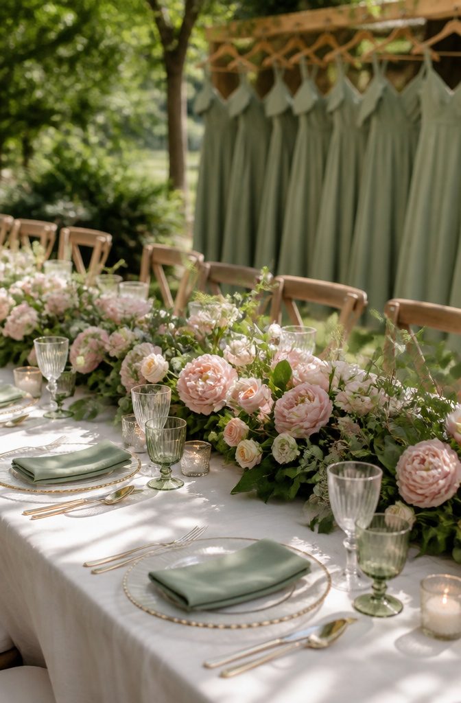
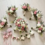
Blush and sage remains one of the most enduring combinations couples choose for a spring wedding color because it feels both romantic and grounded.
The softness of blush adds warmth and elegance, while sage introduces a fresh, natural balance that keeps the look from feeling overly sweet.
Green tones bring freshness and structure, while blush adds warmth and softness. This pairing works seamlessly across fresh blooms and faux florals, bridesmaid dresses, and reception details, making it easy to maintain a cohesive aesthetic throughout the celebration.
Sage green bridesmaid dresses pair beautifully with white decor and elaborate flower bouquets for a fresh, contemporary spring wedding color scheme.
The light shade of green is complementary to a wide range of other spring pastel shades, whether you match sage with neutrals for an airy and modern wedding or other pastels for a classic spring aesthetic.
This combination is easy to apply across florals, attire, and reception styling, creating a look that feels intentional without appearing overly coordinated.

Notice:The flowers are as individual stems across four varieties; you will need to arrange them into a bouquet yourself upon receipt.
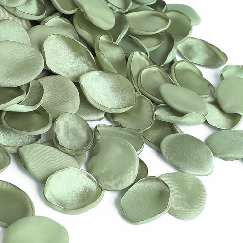
❤️Material: 100% Handmade with satin fabric. They will never wilt and are reusable.
2. Dusty Blue and Ivory
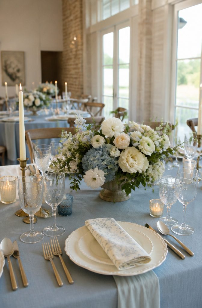
Dusty blue and ivory pair for a calm, timeless look that still reads spring without drifting into Easter territory.
The muted blue carries depth without overpowering a space, while ivory keeps the pairing light and refined rather than clinical. Stark white against this particular blue can feel cold; ivory warms the whole palette just enough.
This combination translates across wedding arches, tableware, and risers, and it earns its place most naturally in venues with abundant natural light.
In those settings, the tones photograph soft and elegant both in camera and in person. The effect stays polished yet approachable, not stiff.
For April specifically, dusty blue sidesteps the brighter, more saturated blues that read holiday rather than wedding season.
The desaturation is what saves it. Ivory then does the work of preventing the overall effect from feeling washed-out or too cool against early spring skin tones.
A cream foundation with lace or satin details extends the palette into the gown itself, and cream table linens or drapery continue the thread without demanding every element match precisely.

Quantity: 1 Round Tablecloth Material: Satin Edges: Hemmed 1 piece, Seamless Design Stain and Wrinkle-Resistant

Material: Premium Polyester Wrinkle Resistant, Stain resistant. How to Care: Warm water wash. Low temp dry. Can be reused again and again, easily over 100 times. Seamless, 1pc design.

What's Included & Size: You will receive 10 dusty blue cheesecloth table runners, plenty for wedding receptions and all kinds of gatherings, each measuring approximately 17 inches wide by 108 inches long. These versatile runners are designed to fit most tables, chairs, and wedding arches. They can even be used as chair sashes, decorative napkins, backdrop draping, or gift wrapping.
3. Lavender and Soft Grey
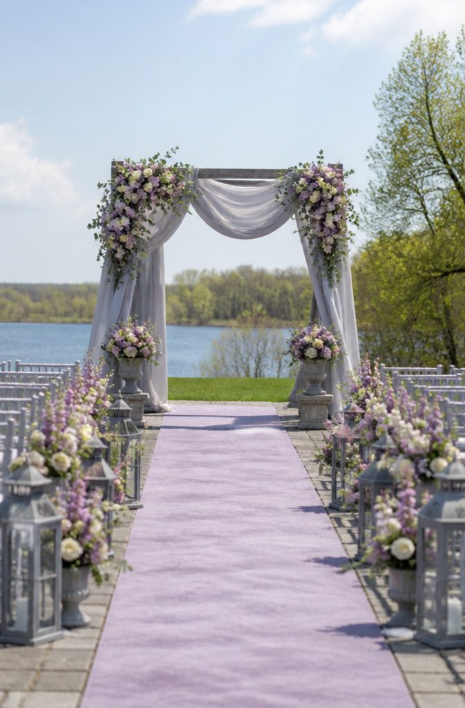
Lavender and soft grey reads as spring-specific without sliding into the predictable pastels you see at every April ceremony.
The muted quality of the lavender keeps it from shouting, while grey gives the pairing enough structure to feel grown-up. Without that grey anchor, you risk veering into prom territory fast.
The danger here is muddy undertones clashing under venue lighting. Lavender leans cool, and not every grey plays nice with it.
A warm grey turns the combination dingy; a blue-grey keeps both colors crisp. Test your linens and florals together in the actual space, not just in daylight at the florist’s studio.
Emerald green and bright yellow make a bolder companion set if you want to push further into spring, though that trio demands more confidence than the original pairing.
For the couple who wants gentle but distinctive, lavender and soft grey stays the safer bet.

・⚪ Extra Large 26 x 20 Inch Size – Bigger than most standard 20 x 14 inch tissue paper. Covers more surface with fewer sheets, ideal for wrapping larger gifts, gift boxes and bags neatly.

Lifelike artificial lavender, pure and elegant, can work with other silk flowers to create lovely bouquets for DIY floral arrangements decor ,that fits perfectly into your personal decor.

【Soft Material】 This avidlove chemise nightgown is made of Polyester and Spandex. It feels very smooth. High quality fabric is so soft to as a sleepwear. It can definitely improve your sleep well-being
4. Soft Yellow and Greenery
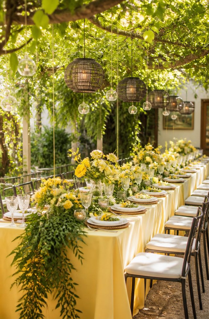
Soft yellow and greenery only works if you keep the yellow in check. Butter or pale daffodil carries the warmth without shouting; sunflower or taxi-cab yellow tips the whole thing toward a caution sign.
I learned that distinction the hard way when a swatch looked gentle in morning light and turned brassy by noon.
Greenery, for its part, means living plants worked into the design itself, not just a sage table runner or a color swatch pulled from a deck.
Ferns, trailing ivy, seeded eucalyptus, or whatever your florist has fresh that week, the living element keeps the palette from feeling printed rather than grown.
April helps this pairing along. Softer daylight and abundant spring florals let the lighter tones read as bright rather than washed out.
Bridesmaids in soft yellow with cream or lime green accents photograph well against that light, and the overall atmosphere stays relaxed rather than staged.
For desserts, lemon-flavored cakes or yellow macarons extend the color without adding another hue to manage. A lemonade station with fresh fruit garnishes fits the same logic, playful but still restrained.

✔ Brand new patented LED dance flashing flame: A newly designed candle flame simulation technology, with warm white light wrapped in yellow flames, thus emitting a more dancing flame effect. When the candle is opened, it will automatically flash, and all candles will emit warm flashing light in the room. This will bring an unparalleled sense of warmth and security to the room. The candle is powered by 2 AA batteries (batteries not included), which can achieve sun protection and fire prevention functions.

DISTINCTIVE NAVY+GOLD DESIGN -- Giving a Gorgeous But Timeless Look: We chose to add gold to the top of the blue cup body to add a sense of sophistication, perfect for navy and gold-themed decoration. Mercury speckled effect on the votive candle holders will enhance the natural warm light of candles, keep shining in your life.

BLUE VOTIVE CANDLE HOLDERS-- For wedding Decorating: Volens mercury glass votives are the perfect table centerpiece decor for weddings, engagements, bridal showers, and party dinners. Elegant colors and designs are visually attractive and can perfectly supplement your blue-themed wedding decoration.
5. Peach and Soft Coral
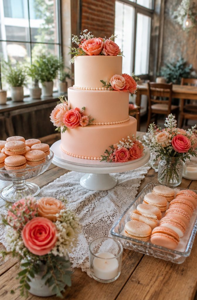
Peach and soft coral sit close enough on the color wheel that couples often treat them as the same shade, but the difference matters.
Peach carries more yellow, a blush that reads as morning light, while coral pulls in red notes that lean toward evening.
Layered rather than matched, they create depth without competing. A peach tablecloth with coral napkins, or coral bridesmaid dresses against peach blooms, keeps the eye moving.
The warmth here risks feeling like July if you push it too saturated.
Muted tones solve that. Think of the difference between a ripe apricot and one still firm on the counter; the softer version reads as spring because it withholds the full heat.
This palette works especially well as spring moves into its later weeks, when longer days invite slightly richer color but outdoor venues still need a gentle hand.
For florals, peach roses or dahlias pair with cream or light yellow blooms to keep the arrangement airy. The coral belongs in smaller touches, a ribbon or a single accent flower, so it does not overtake the softness.
Stationery in watercolor peach with coral calligraphy ties the thread without overmatching. The result bridges spring lightness with the first hint of summer warmth, polished rather than loud.

Pastel Balloon Arch: 3 pcs 18" dusty green/dusty purple/pastel yellow balloons, 38 pcs 12" gold confetti/dusty green/dusty purple/pastel yellow/pastel green/pastel pink balloons, 68 pcs 10" metallic gold/dusty green/dusty purple/pastel yellow/pastel pink/pastel green balloons, 60 pcs 5" metallic gold/dusty green/pastel yellow/pastel pink/dusty purple balloons and 4 pcs balloon tools

Package: 1 raw eucalyptus and willow leaf flower garland 6ft by 13.75" wide and 3.5" tall (after fully stretched).

Complete Wedding Decoration Kit:Create a beautifully coordinated wedding with one all-in-one decoration set. Includes sage green and ivory chiffon arch drapes, chair sashes, artificial flower garlands, eucalyptus greenery, rose stems, Mr & Mrs signs, balloons, ribbons, and 100 rose petals, making it easy to decorate without purchasing matching pieces separately
6. Rich Violet
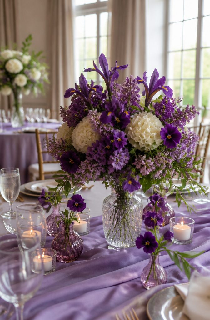
Rich violet carries a risk in April daylight: too much saturation reads heavy against spring’s soft light, and a guest arriving at noon can feel like they walked into evening.
The hue sits in a useful middle ground, though, bridging the pale lavenders of early spring and the deeper jewel tones autumn couples reach for.
That timing is what makes it workable for an April wedding if you control the dose.
Treat lavender as your neutral base and let the richer violet arrive in concentrated accents.
Pale lavender linens or groomsmen shirts set the temperature low enough that violet sugar flowers on the cake, an ombre frosting detail, or saturated table runners register as deliberate rather than overwhelming.
Two directions show up in actual weddings: one keeps violet to florals, violets or irises against cream, the other layers it with peony pink for more energy. Sky-blue jewelry on bridesmaids in violet gowns cools the combination down for daytime.
The move that fails is dressing the whole wedding party in full violet and adding violet linens, violet cocktails, violet lighting.
By cocktail hour the color has nowhere to rest. I would rather see one strong violet element, the cake or the bouquets, with everything else stepped back to lavender or cream.
The drinks can nod to the palette, violet-infused cocktails or lavender lemonade, but they should read as refreshment first and theme second.

♔GORGEOUS MIXTURE & UNIQUE DESIGN-Floweroyal artificial green flower set contains a beautiful variety of flowers, as well as some plastic stems to use for floral arrangements. The blossoms are made of silk flowers with plastic centers and greenery. Vibrant color and elegant touch make it more real. A varied mix of flower shapes and shades, which makes for a very attractive, nicely-toned arrangment. Go well with the florals you already have at home. Great for filling your living spaces.

Elegant Satin & Tulle Design for Special Occasions: Crafted with a smooth, high-quality satin bodice and a fluffy tulle skirt, this dress balances sophistication and whimsy. The sleeveless silhouette features a delicate pearl-trimmed neckline and a plunging V-back, adding a touch of luxury that’s perfect for flower girl duties, first communions, birthdays, or any formal event.

Premium Material: These rose petals are 100% Handmade with satin fabric for a real looking appearance and with a slight fragrance of rose smell
7. Sky Blue
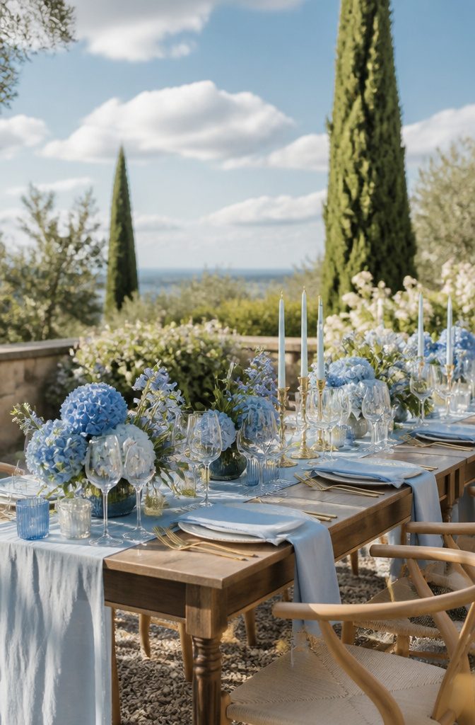
Sky blue reads younger and cleaner than the dusty blue that has dominated the last few years of spring weddings.
Where dusty blue carries a weathered, almost vintage weight, sky blue opens up a room and catches April daylight in a way that flatters every skin tone.
The risk is real, though: without careful pairing, the same freshness can tip into nursery territory fast.
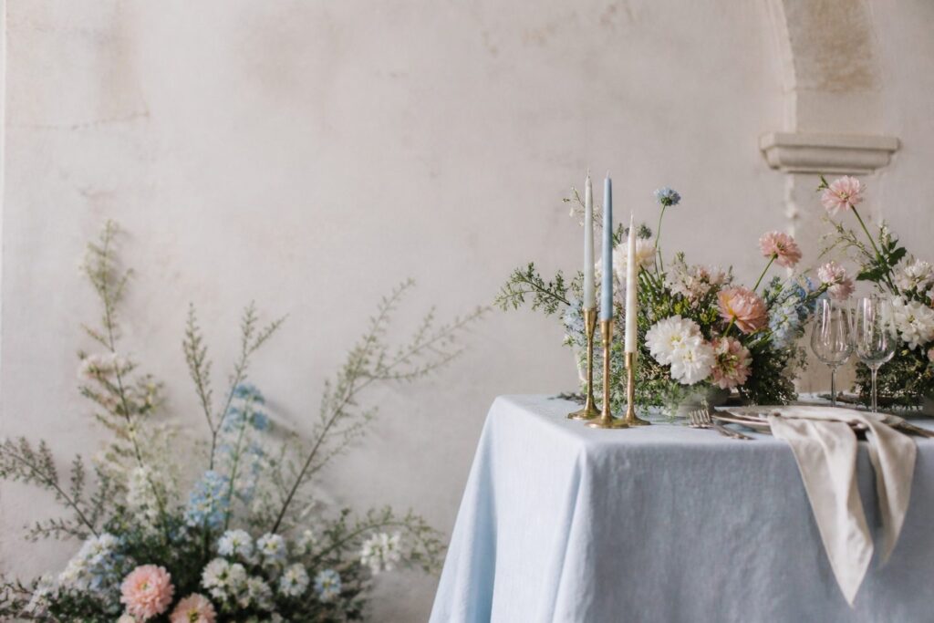
Anchor it with brass or aged gold rather than silver, which can push the palette toward ice and infancy. Warm metallics give sky blue the grounding it needs to feel intentional on a wedding day.
Wood tones work the same way. Pale oak or raw pine will wash out against it; walnut or a mid-tone cherry add the gravity that keeps the color from floating away.
I have seen the combination work best when the blue shows up in large fields, like table linens or a bridesmaid dress, and the wood and metal arrive in smaller, sharper accents: a candlestick, a place-card holder, the edge of a frame.
One April ceremony I planned around used too much sky and too little warmth, and the reception tent looked like a gender-reveal waiting to happen.
The fix was simple in retrospect: swap half the silver for brass, and the whole room matured overnight.
Package Include: you will get 12 pieces 10ft length dusty blue cheesecloth table runner, enough quantity is suitable for wedding banquets and various parties, the size of each table runner is approximately 35 x 120 inches / 90 x 300 cm, which is large enough to cover rectangle and round tables, can also be spliced together for long tables. Even can be used for chair cover sashes or decorative napkins, backdrop draping or even gift wrapping.

Disposable tablecloth set; Our 4 packs of blue tablecloths are 54 inches x 108 inches in size. These tablecloths are made of high-quality PEVA plastic, which is not only durable but also ensures you have a non-toxic and odorless environment, suitable for most rectangular tables.
8. Fuchsia
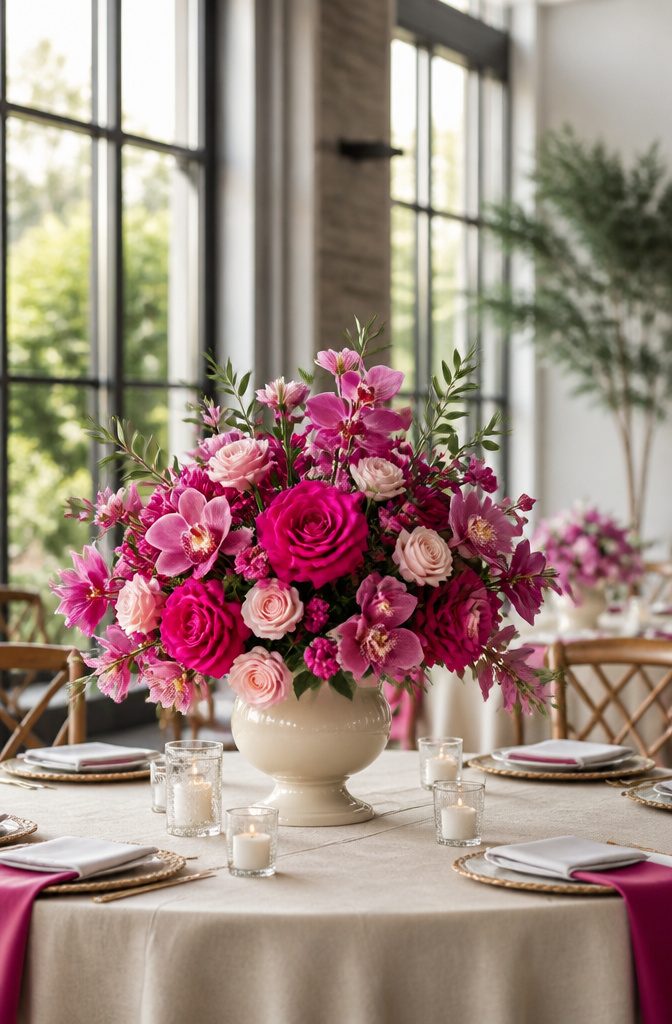
Fuchsia lands differently in April than it does in July. In late spring it reads as a controlled burst of energy, not the full-volume summer shout.
Treat it as an accent, not a wall of color. Three or four fuchsia roses in a cream bouquet pull the eye without the aggression that true red brings to the same arrangement.
Bridesmaids in full fuchsia against a neutral backdrop create that striking contrast; keep the surrounding palette soft with cream, lime green, or a whisper of peach.
Table runners, napkins, or candles carry the color into the reception without letting it own the room.
What actually grows in this color matters, because too much of what gets sold as fuchsia is dyed. Roses, orchids, and ranunculus come by it naturally.
Peonies do not; if your florist offers fuchsia peonies for an April wedding, ask whether they were treated. The answer changes your budget and your timeline, since dyed blooms need ordering further out and carry a different price structure.
Berry-flavored desserts or cocktails garnished with fresh blooms extend the accent into the meal without adding another fabric or rental line.

✅ Turkish Luxury 6 Piece Towel Set Includes 2 Bath Towels of 27 x 54 inches, 2 Hand Towels of 16 x 28 inches and 2 Washcloths of 13 x 13 inches.

Material: 100% polyester chiffon table runner, lightweight and soft, crafted with heat-cut seamless edges. It shimmers subtly under light, adding an elegant and flowing touch to your table.

♕Velvet Ring Box : This wedding ring box is made of high quality velvet material, which featured with fine, soft, shiny, comfortable touch.
9. Neutral Greens and White
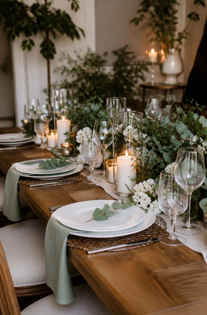
Olive, sage, and moss read as the neutral greens worth building a palette around, not the brighter or more blue-tinted shades that fight April’s softer light. White keeps the pairing from going flat, but the real work falls to texture.
Linen against glazed ceramic, matte wax candles beside glossy eucalyptus leaves, rough-hewn wood under polished glass: these variations do what color variation normally would. A sage bridesmaid dress beside a white gown needs nothing else if the fabrics differ enough.
The same holds for tables: white linens with green centerpieces work because the eye reads the contrast in stems and petals rather than in hue.
Texture substitutes for color variation here, and that is the detail that saves this palette from reading as unfinished rather than intentionally restrained.

SET OF 12 VOTIVE CANDLE HOLDERS: Includes 3 blue, 3 silver, 3 gold, and 3 champagne holders for a colorful, versatile collection.
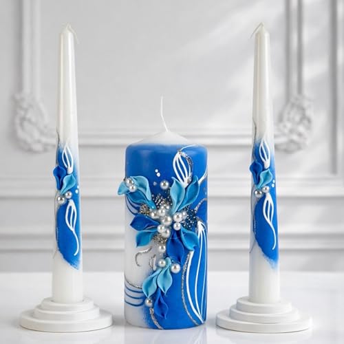
💙Elegant Sapphire-Inspired Floral Design Celebrate your wedding with a handcrafted unity candle set featuring rich sapphire blue tones, delicate floral embellishments, pearl-inspired accents, and shimmering silver details. A stunning centerpiece for elegant, classic, and contemporary weddings.

BLUE CANDLE HOLDERS❤️--Antiqued Metallic Finish: Mercury speckled effect on the blue tealight holder will enhance the natural warm light of candles, giving it a vintage but vibrant look. Use these pretty green mercury glass votives as part of your overall decor, they will take the elegance of your decoration up by several notches.
10. Light Pink and Peach
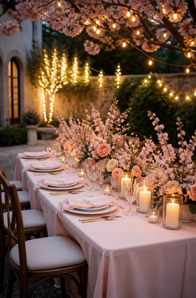
Light pink reads cooler than blush, closer to spun sugar than to skin tone, and that extra chill risks feeling juvenile without something warm beside it.
Peach does the work. It pulls the palette toward sunset rather than toward nursery decor, and the pairing lands in a space that feels grown-up without turning formal.
The trouble shows up outdoors. April sun is still thin, and when the light is overcast the whole combination can flatten into something washed out and vague.
A peach with real orange in it, not just a pale apricot, holds enough pigment to survive a grey afternoon. Without that saturation, centerpieces and bridesmaid dresses both disappear against early spring grass.
Indoor April weddings have more flexibility; walls and candlelight give the pink somewhere to register. Outdoors, the same couple needs to commit to the deeper peach or watch their palette mute itself by 3 p.m.

[Spring Green Garland] Ideal for DIY lovers and event planners alike, this artificial rose garland is incredibly versatile. Drape it over a wedding arch for a romantic forest vibe, or use it as a flower garland for table centerpieces to create an inviting atmosphere for your guests. Unlike real greenery, this wedding garland won't wilt or drop leaves, ensuring your decor looks flawless from the first guest's arrival to the last dance.

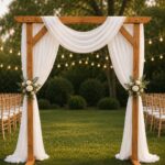
Wedding Arch Draping Fabric Package - This package includes 2 panels premium sage green sheer drapes, each panel measuring 28 inches wide by 19 FT long, providing ample fabric to elegantly cover any size wedding arch or wedding backdrop for a stunning visual effect

Package Includes: Blush Pink--5"*15pcs/10"*10pcs/12"*5pcs/18"*1pcs; Sage Green--5"*15pcs/10"*10pcs/18"*1pcs;Macaron Pink--5"*15pcs/10"*10pcs; Macaron Yellow--5"*10pcs/10"*10pcs/18"*1pcs; Sand White--5"*10pcs/10"*10pcs/18"*1pcs
11. Royal Blue
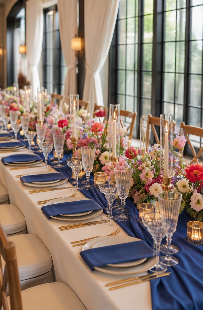
Royal blue carries a formality that can tip cold if you let it. In April, that risk is real: the color reads corporate under fluorescent hotel lights and winter under overcast skies.
The fix is in the pairing. Warm metallics, cream rather than stark white, and seasonal florals like tulips or sweet peas keep the palette from feeling like a gala held in the wrong month.
Daytime April weddings get the harder test. Sunlight brightens royal blue toward something almost electric, which can flatten a dress or tablecloth into a single loud plane.
Matte fabrics and varied textures, velvet against linen, break that surface up. Evening events are more forgiving; candlelight deepens the color to something closer to midnight, and the spring context stays clear through the flowers and the greener menu.
Balance royal blue with warm cream and seasonal blooms, and it works for April. Leave it standing alone with silver accents, and guests may wonder if they missed a memo about the dress code.
12. Navy and Gray with Bold Pops
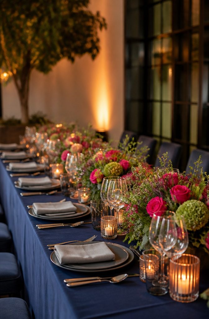
Navy and gray are the frame, not the April story.
They read corporate in December and funeral in February, but hot pink or burnt orange against navy wakes them up for spring. That contrast is where the season enters.
Gray suits for groomsmen and navy table linens give you the sophisticated base.
The pop does the seasonal work: fuchsia roses or ranunculus in arrangements, a fuchsia frosted cake, maybe berry cocktails garnished with fresh blooms. Lime green works too, paired with cream instead of white to keep it warm.
Other seasons play this differently. Burnt orange against navy reads autumn harvest, not spring bud.
Hot pink in July can feel tropical overload. April owns the transition: bold enough to break winter’s hush, still fresh enough to feel like opening.
13. Minimalistic Green and White
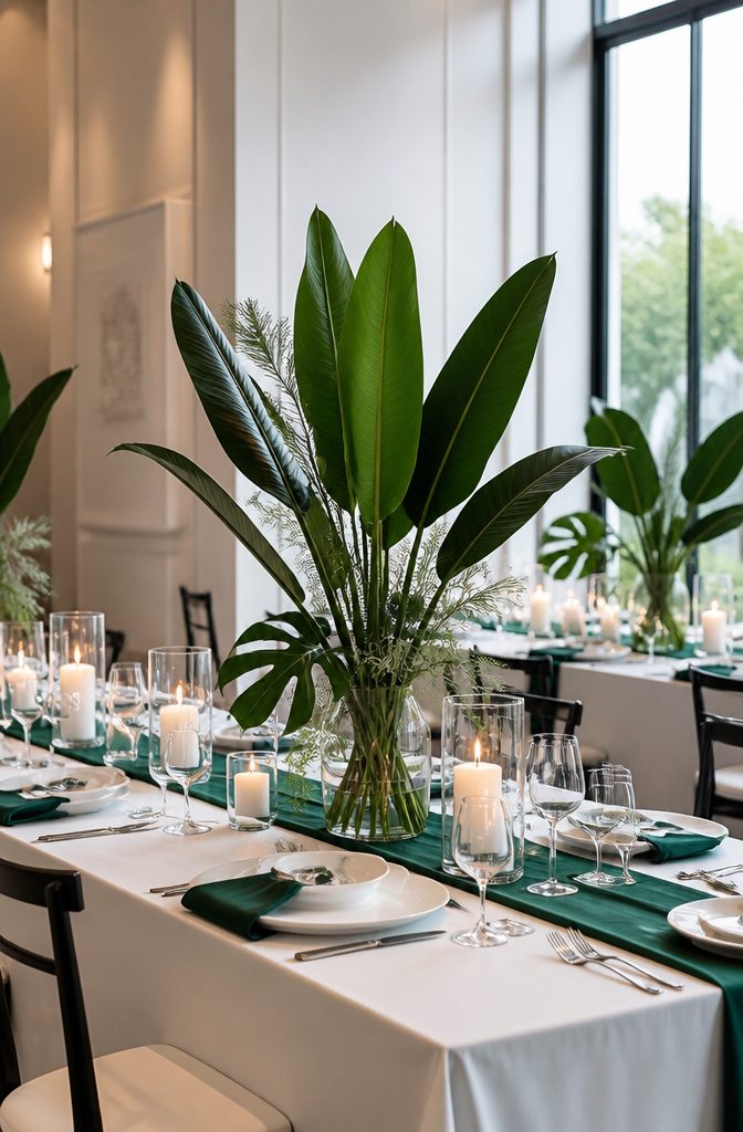
Minimalistic green and white reads as a statement rather than a suggestion, and that is exactly what makes it work for April.
The green is one saturated tone, emerald or forest, not the washed sage or olive that tends to read as neutral background.
The white stays absolute, the kind with a faint blue undertone that can look almost cold next to cream or ivory. Together they feel deliberate, edited down to two choices instead of a range.
This palette belongs in venues with some architecture to echo it: concrete floors, steel railings, glass walls, spaces where the color can sit against hard lines without competing.
A barn or garden tent fights it; the green looks like an accident and the white goes muddy in natural light filtered through canvas.
I have seen couples try to soften this combination with wood tones or blush accents, and the effect is not warmth, it is hesitation. The strength is in the restraint.
For April specifically, the risk is spring itself pushing in. Early blooming branches, forced tulips, any element that whispers "garden party" undoes the flat graphic quality.
Florals should be structural: single stems, massed, or broad leaves without bud or bloom. The money here goes to fewer, larger pieces rather than volume spread thin.
14. Different Shades of Pink
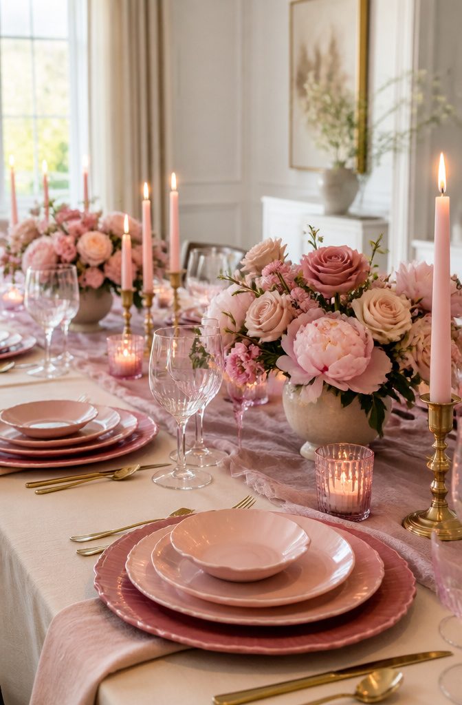
Multiple pinks in one April wedding read as intentional only when they sit far enough apart in value and temperature to avoid looking like a dye-lot mistake.
Pale pink paired with dusty rose works because the distance between them is clear; one reads as morning light, the other as shadowed petal.
Layer in peony pink for a third stop, and the gradient holds as long as you keep each shade in its own zone, bridesmaids in one tone, cake layers in another, floral arrangements stepping from baby pink to deep rose.
Where this collapses is temperature clash.
A cool peony pink against a warm dusty rose fights itself under venue lighting, especially as evening shifts the spectrum. Overmatching every detail to a single pink flattens the look, while too many competing shades turn busy rather than cohesive.
The safer move: pick two pinks with enough separation, add champagne for depth rather than a third competing pink, and let the variation live in material texture instead of chasing more color names.
15. Yellow and Sky Blue
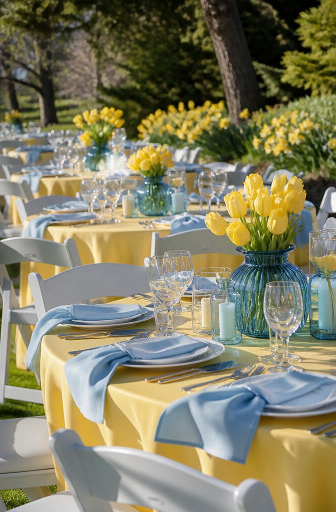
Bright yellow and sky blue bring literal April weather into the room: the flower and the sky behind it.
The pairing works because the season itself delivers both colors in the same frame, but the wrong tones slide fast into nursery or beach territory.
Keep yellow toward daffodil and sunflower saturation, and sky blue cool rather than turquoise, and the result reads as spring field rather than seaside rental.
This pairing works two ways. One approach goes full outdoor wedding with yellow tablecloths and sky-blue chair ribbons, letting the natural surroundings do the toning work.
Another pulls the blue into drapery, lighting, or table settings and pairs it with delphiniums or hydrangeas for the floral hit, then adds the yellow through daffodils, tulips, or sunflowers rather than fabric.
Both ways need the same discipline: if the yellow softens to butter or the blue warms toward aqua, the effect turns decorative rather than seasonal.
For April specifically, the flowers that actually carry both colors are daffodils and certain delphinium varieties, which means this palette can be built from real blooms at their natural peak rather than dyed imports.
That matters for budget, and for the look holding up in photographs through an afternoon that might still turn breezy or overcast.
How to Pair Colors Without Overmatching
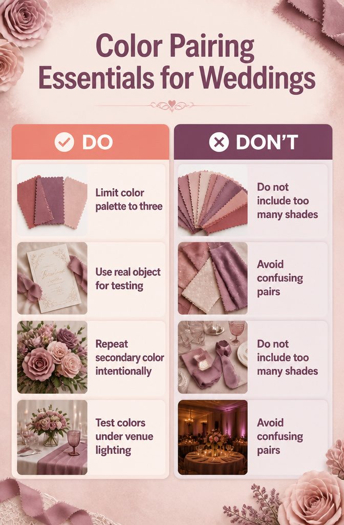
Three colors is the ceiling, not the floor. At my sister’s April wedding, she started with dusty rose and mauve, then kept finding "one more" shade that almost matched, until the florist asked which pink she actually wanted.
One dominant, one secondary, one accent stops the drift before your rentals, flowers, and table linens start competing.
I landed there by accident myself. I had a swatch book with nine related tones and could not let any go.
The dress shop had a name for every one, which made them feel necessary. They were not.
Now I test palettes against a single real object: the invitation, a fabric swatch, or one stem from the bouquet.
Everything else gets compared to that item, not to each other. The secondary color should repeat enough to feel intentional; the accent appears two or three times, total.
A fourth shade does not add depth. It creates chores, because suddenly you need a tie, a napkin, and a favor box in a color nobody stocks together.
Venue lighting finishes what the palette starts.
Dusty rose and mauve shift under evening lamps; what reads soft in afternoon sun can flatten to mud indoors. Check your colors where guests will actually see them, not under the white-balanced glow of a screen.
Reading Venue Architecture Against Your Palette
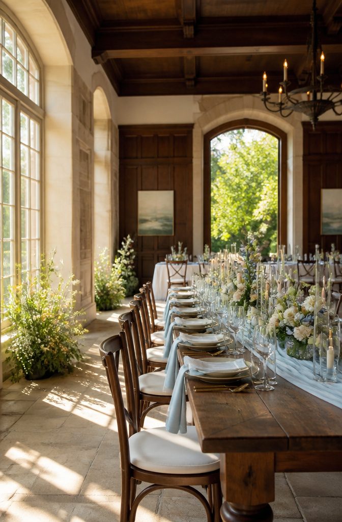
A venue already has its own colors, and they do not change for your wedding. The limestone floor, the mahogany paneling, the daffodils planted along the garden path, those are fixed.
Pale blue and white works almost anywhere because it borrows light rather than fighting surroundings, but richer palettes like violet or fuchsia need a blank-slate space, a white-walled gallery or a tent, to read as intentional rather than clashing.
I learned to walk the venue at the same hour the ceremony will happen and name the three dominant tones in the architecture and landscape. If two of them already feel like spring, the palette should coordinate, not compete.
Black bridesmaid dresses with light gray suits for the groomsmen handle this the other way: the neutral core absorbs almost any background, and the spring greenery supplies the color the venue already owns.
The mistake is choosing the palette in a vacuum and hoping the space will adapt. It will not.
What Spring Actually Looks Like in April
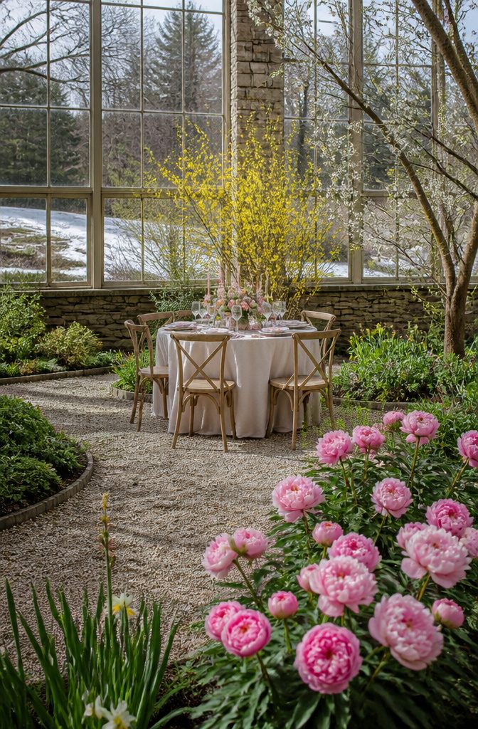
April weddings sit at a tricky intersection in most US growing zones. The calendar says spring, but the landscape may still be catching up.
What is actually blooming depends heavily on your date and your latitude: early April in Zone 6 can look like late winter, while late April in Zone 8 already carries the full weight of the season.
Build the palette from what actually shows up outside. Soft yellow appears in early daffodils and forsythia.
Fresh greenery pushes through on bare branches and new ground cover. Peach and peony pink arrive with the first tree blossoms, though these can be brief, wind-blown, and hard to time.
By mid-month in moderate zones, you might see rich violet from early iris and the first herbaceous growth that gives lime green its saturation.
This matters for your color decisions more than most couples realize. A palette drawn from peak spring, like fuchsia or sky blue, assumes florals that may not be available locally for an early-April date.
Tan and dark green, pulled from the still-dormant earth and evergreen structure, read as more honest to the actual season in many regions.
The choice becomes whether you work with what the landscape offers or import the full chromatic range of late spring at higher cost and carbon footprint.
Why Blue Means Calm and Yellow Means Happy
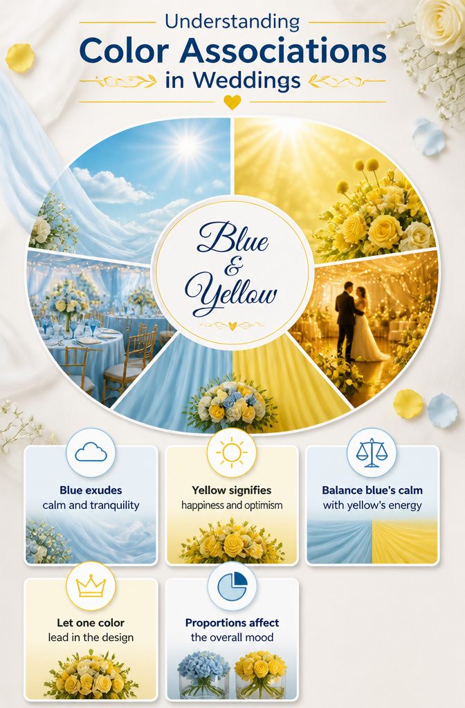
Blue reads as calm because we already know it that way, and yellow carries the same instant association with happiness. Sky blue is described as calming and ethereal, matching spring skies, while light yellow exudes happiness and optimism.
I use these labels as a sanity check, not a rulebook. A palette built on both should feel balanced, not mixed-message, so ask whether your blue calms enough against your yellow’s energy before you commit.
If the ceremony mood is quiet and the reception turns loud, the pair can work, but only if the proportions let each tone do its job. Sky blue drapery against yellow chairs might feel like two weddings sharing a room.
The safer move is to let one lead: yellow in the flowers alone, blue in the linens and light, or the reverse. That check, not the color wheel, is what keeps the feeling intentional.
Frequently Asked Questions
What are the best wedding colors for April?
Blush and sage, dusty blue and ivory, and soft yellow with fresh greenery rank among the strongest choices for April weddings.
Each pairing reads as spring-specific without drifting into Easter pastels or summer saturation. The softer daylight and blooming florals of April flatter muted tones that would wash out in July or feel cold in March.
How do I choose a wedding color palette?
Start with one dominant color, one secondary, and one accent, then stop. Trends help as inspiration, but the best palette reflects your venue’s fixed colors and the feeling you want the day to have.
Test your actual fabrics and florals under the venue’s real lighting, not just in daylight at the florist’s studio, because evening lamps shift how colors read.
What are common mistakes when choosing wedding colors?
Overmatching colors to every single detail and using too many shades are the two biggest errors. Adding a fourth color does not add depth; it creates chores because rental companies and florists rarely stock the same custom shades together.
Another mistake is choosing the palette in a vacuum and hoping the venue will adapt to it, when the limestone floors, mahogany panelings, and planted gardens are fixed and will not change.
What are the wedding color trends for spring 2026?
For 2026, expect continued strength in blush and sage, dusty blue and ivory, and lavender with soft grey as the foundational palettes.
Newer directions include rich violet used as a concentrated accent against lavender, sky blue anchored with brass or aged gold instead of silver, and minimalistic green and white with one saturated forest or emerald tone rather than washed sage.
The move toward intentional restraint, fewer total shades, and texture substituting for color variation is what distinguishes 2026 from the broader palettes of recent years.
What are the most popular wedding colors for April 2027?
The palettes ranking strongest for April 2027 mirror the 2026 direction: blush and sage, dusty blue and ivory, soft yellow with greenery, peach with soft coral, and lavender with soft grey.
Timeless pairings that photograph consistently across changing forecast years tend to stay at the top, while bolder accents like fuchsia or rich violet shift in how they are deployed rather than whether they appear at all.
What colors look good in April?
Colors with muted saturation and warm undertones read best against April’s softer, thinner daylight. Stark whites can feel clinical; ivory and cream warm palettes just enough.
Bright yellows survive only in butter or pale daffodil tones; sunflower saturation slides toward caution-sign territory. Sky blue works better than turquoise, and peach needs real orange pigment to hold up under overcast skies that flatten paler apricot shades.
What to wear for an April wedding?
For guests, the safest approach mirrors what works in palettes: warm neutrals with muted rather than saturated color, fabrics with texture variation, and layers because April weather shifts.
For couples, the gown color matters to the whole palette; a cream foundation with lace or satin details extends into dusty blue or lavender schemes better than stark white, which can turn cold against muted spring tones.