A burgundy wedding theme shows up in almost every part of the day, from table settings and floral arrangements to bridesmaid dresses, groomsmen suits, and the cake, and the list below covers where it works best.
Burgundy shifts from a deep, saturated base in candlelight to something lighter in afternoon sun, so the sections below show how to use it across every part of your day, from drapery and invitations to dessert tables and wedding favors.
The proof is in the fabric weight: velvet curtains need their own uplighting to keep from photographing as flat brown, while chiffon bridesmaid dresses in the same color move fine outdoors and cost about the same.
1. Burgundy Table Settings
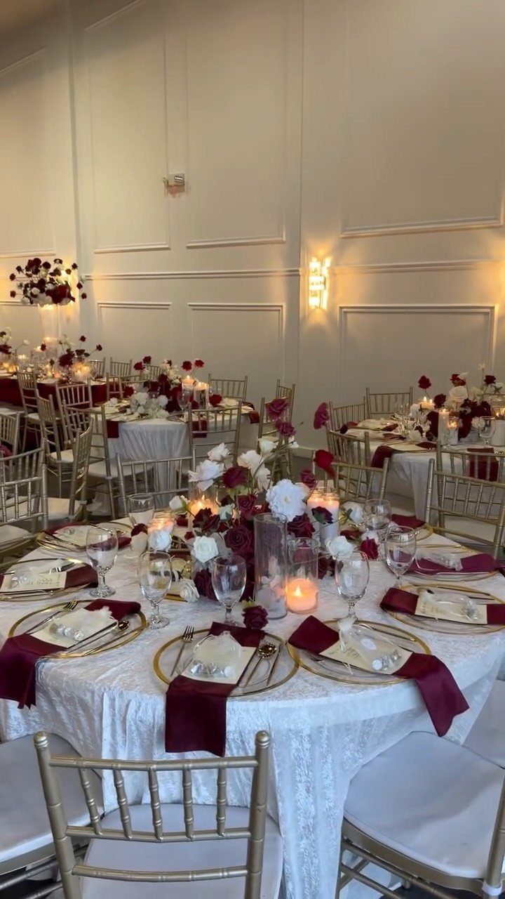
Burgundy napkins against white lace catch light differently than all-white settings; the color grounds the table without darkening it. Gold chargers and candlesticks pair cleanly with the napkins, and the combination reads formal without needing every piece to match.
I would skip colored glassware here; the palette already has enough layers, and clear glasses keep the place setting readable for guests.
For a warmer take, burnt orange napkins swap in easily against the same white base, especially with freesia or carnations on the table.
That version suits fall better and costs about the same, though it loses some of the evening formality the burgundy-and-gold carries.

SMOOTH SATIN NAPKINS: Satin cloth napkins are made of high-quality 100 percent polyester (satin fabric). Silky satin napkins has a smooth touch with charming and shiny colors, you can fold out various shapes according to your ideas. Machine washable, reusable, not easy to wrinkle and fade.

❤Product Material: This satin napkin is made of ultra smooth and soft satin fabric, and multiple colors can perfectly match many important occasions and parties.

FANCY SATIN NAPKINS: Square Burgundy Napkins are crafted from 100% polyester satin fiber, with soft feeling in hand, smooth and delicate. Shiny satin dinner napkins with neat edges, which can be folded into various shapes with good plasticity.
2. Burgundy Floral Arrangements
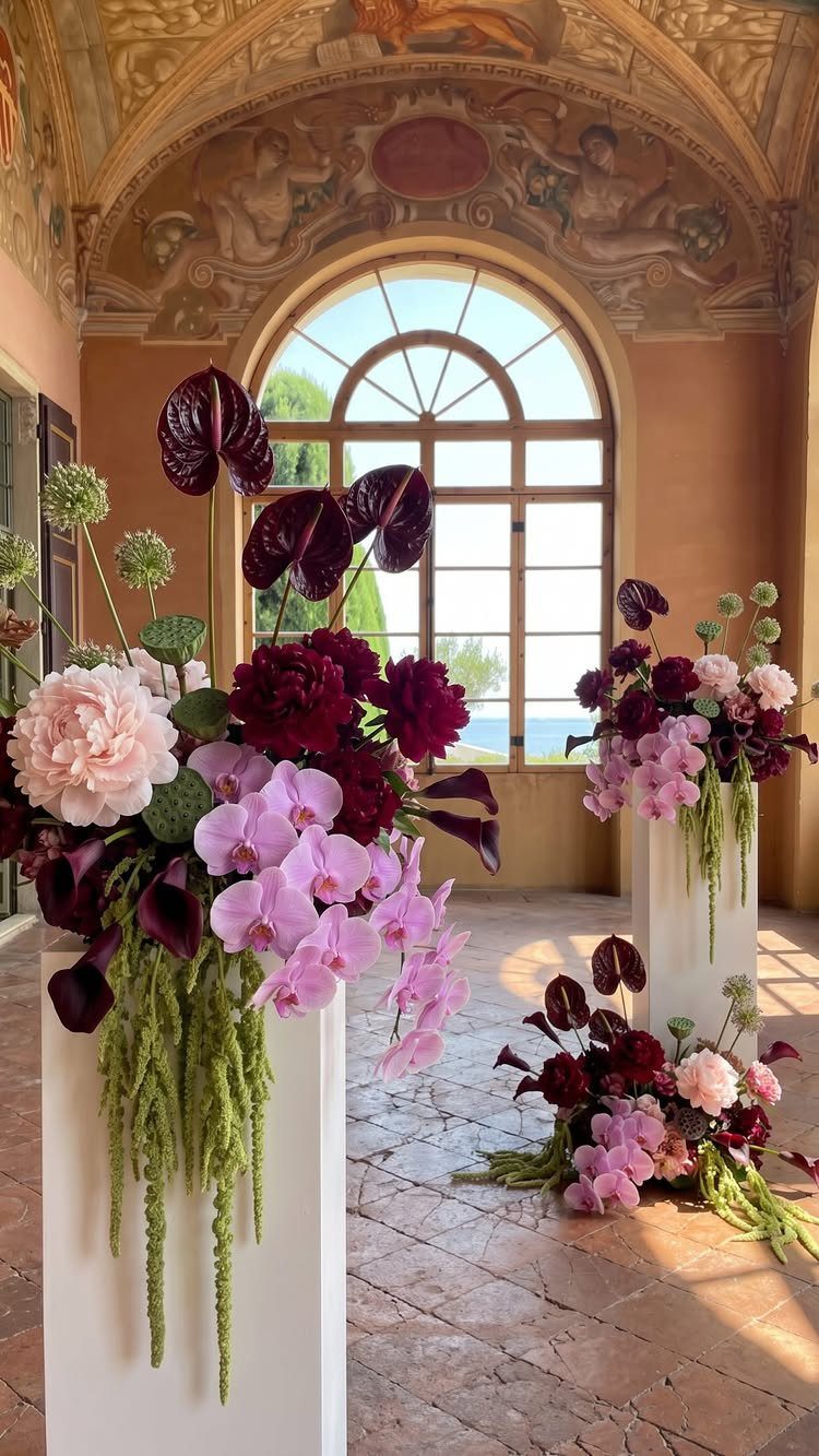
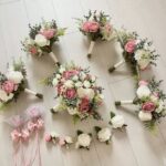
Deep burgundy roses hold their color in photographs better than lighter reds, which wash out under reception lighting; that alone makes them worth considering for centerpieces.
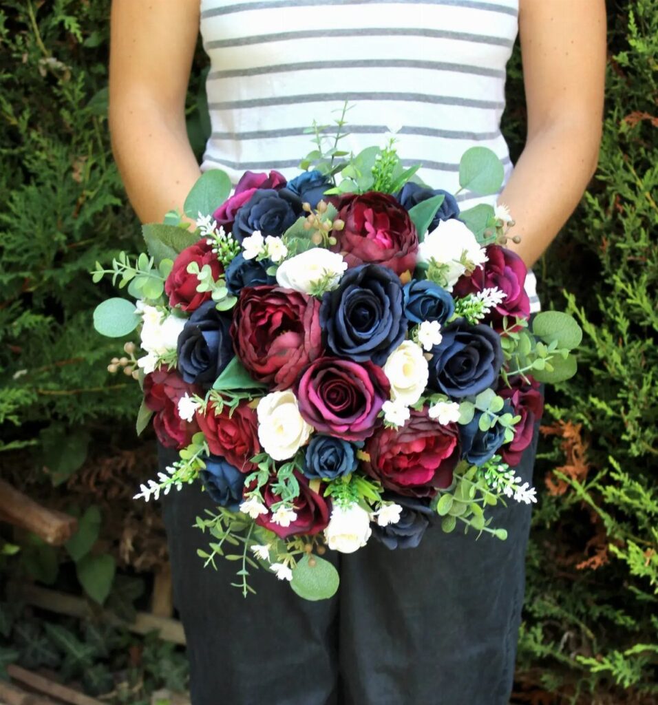
Dahlias and peonies add different shapes, and mixing the 3 keeps bouquets from looking too uniform.
I would add pale pink or ivory blooms somewhere in each arrangement, even a few stems, because burgundy on its own can go flat against a neutral room.
For a bolder reception, blue delphinium or purple clematis contrast directly with the burgundy; that version needs confidence and a venue with enough light to carry it.
Fresh greenery costs less than extra flowers and does more of the visual work than people expect.

DISTINCTIVE BURGUNDY+GOLD DESIGN -- Giving a Gorgeous But Timeless Look: We chose to add gold to the top of the burgundy cup body to add a sense of sophistication, perfect for burgundy and gold-themed decoration. Mercury speckled effect on the votive candle holders will enhance the natural warm light of candles, keep shining in your life.

High Quality & Durable : Made of 100% spun polyester with strong stitching, soft and durable to protect your table surface from hot pans, scratches and spills.

10FT Burgundy Table Runner: Our burgundy cheesecloth table runner is measure 35 wide x 120in(10ft) long, can be perfectly and gracefully placed on the table and hung on the floor, which will add a romantic atmosphere to your christmas.
3. Burgundy Bridesmaid Dresses
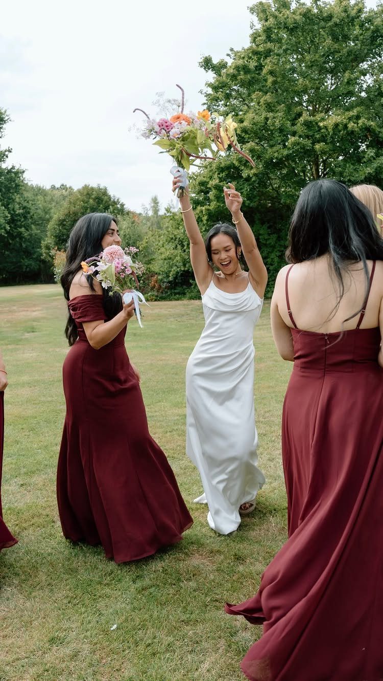
Chiffon in burgundy moves well in outdoor light and photographs without heavy shadows, so it suits daytime ceremonies better than satin or velvet.
A-line and mermaid cuts both work in this color; the fabric handles the drape, not the silhouette. Gold jewelry reads warmer against burgundy than silver, though either keeps the look cohesive.
One practical note: floor-length hems in outdoor grass pick up stains fast, and burgundy shows dust lighter than it is.
Tea-length or high-low cuts solve this for garden weddings without breaking the palette. If the bride’s gown is ivory rather than bright white, the contrast stays soft enough that the group photographs as a unit.

Supreme Material: All artificial roses are made of a soft high quality latex foam which gives them a velvety finish that makes them super realistic. No smelly, No fade, No misshapen, No spotted and the color of the flowers are vivid and uniform, look and feel like real roses.

❤️Material: Floroom Studio's artificial roses are crafted from soft, high-quality PE foam, which lends them the look and feel of fresh flowers.

Burgundy Roses Artificial Flowers Set Quantity: A combo box packs a variety of flowers as vintage or rustic themed wedding. A total of 20 dusty fake flowers and 9 accessories including mixed silk and foam burgundy roses artificial flowers with stems
4. Burgundy and Navy
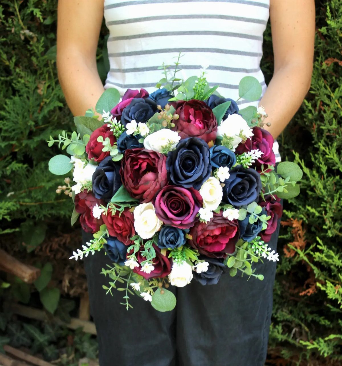
Navy and burgundy both read as near-black in dim light, so this pairing needs illumination to function; candles or strong venue lighting are not decorative extras here, they are required for the colors to separate.
A navy suit with burgundy tie or pocket square keeps the groomsmen’s side quiet enough that bridesmaids in full burgundy do not compete. Silver tableware sharpens the contrast further; gold softens it.
I would reserve this for evening or winter weddings.
In garden daylight, both colors go flat and heavy. The academic formality of the combination also sits oddly at casual venues.

Fabric and Design: Crafted from lightweight chiffon. Spaghetti straps pairs with square neckline, balances the volume of the layered skirt, works effortlessly for both daytime weddings and evening party. Pleats gather around the waist to conceal the tummy and accentuate an hourglass silhouette. The asymmetric multi-layer ruffle skirt, high-low and sweeping train hem create a romantic effect

Size Attention: Made from soft chiffon fabric with a flowing silhouette. Designed with a fitted waist to flatter different body types. Please choose your size based on our size guide to ensure accurate measurements and a perfect fit before ordering

Features: Chiffon, V Neck, Long Sleeves, Ruffle, Side Slit, Ruched, A Line, Lace Up Back, Floor Length
5. Burgundy Wedding Cake
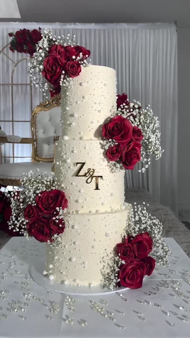
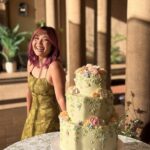
Burgundy sugar roses on white icing give the color impact without committing the whole cake to a dark tone that can read muddy in reception hall light.
Edible pearls and gold monogram initials add structure; the eye needs something crisp to rest on. Fresh flowers instead of sugar work for rustic settings and cost less, though they must be food-safe varieties and added on site.
A full burgundy-iced tier risks the "showstopper" effect the phrase promises, but dark fondant shows every fingerprint and temperature fluctuation.
I would keep the base white and let the decoration carry the color. For a wine tie-in, a blackberry-merlot signature cocktail at the bar extends the palette without repeating the cake’s exact statement.

SUPERIOR VELVET MATERIAL: Our curtains are made of 300 GSM high-quality velvet fabric, featuring an extremely soft touch and heavy vertical sense, as well as vibrant and long-lasting colors that are resistant to fading. More than just window dressing, they hold OEKO-TEX & GRS certifications with 50%+ recycled polyester. Non-toxic and gentle, they fill your home with a warm relaxing ambiance and stay safe for sensitive skin, kids and pets.

LUXURIOUS VELVET FABRIC:Crafted from high-density velvet fabric, these curtains are silky-smooth, soft to the touch, and feature a rich, heavy drape for an elegant look,adding depth and luxury to living rooms, bedrooms, nursery and more.

Package: The package includes set of 2 elegant velvet curtain panels. Each luxury curtain measure 52 inch wide and 84 inch length. Each window drapes has 8 silver metal grommets with 1.6-inch inner diameter, fit well with most rods. Easy to hang, and slide smoothly.
6. Burgundy Invitations
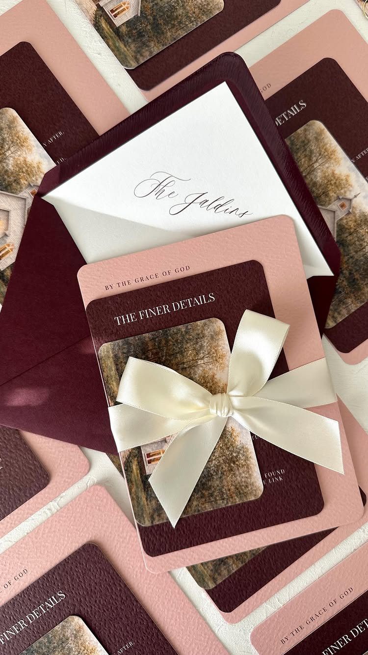
Burgundy envelopes with blush pink interior cards create a tension that reads romantic rather than mismatched; the blush softens what could otherwise feel like a winter color used year-round.
Gold foil on burgundy cardstock needs careful proofing; the contrast is lower than gold on white, and thin lettering can disappear.
I like ribbon ties for keeping multipiece suites together, though they add postage weight and sometimes require hand-canceling at the post office.
A wax seal in burgundy carries the theme further but risks cracking in summer mailboxes; for August weddings, skip it.
The invitation sets the expectation for the event’s formality, so the embellishments should match what guests will actually encounter: foil and layered cards for seated dinners, simpler flat printing for casual receptions.

Smooth Satin Napkins: Satin cloth napkins are made of high-quality 100 percent polyester (satin fabric). Silky satin napkins has a smooth touch with charming and shiny colors, you can fold out various shapes according to your ideas. Machine washable, reusable, not easy to wrinkle and fade.

Premium Quality Fabric: These napkins are made of delicate satin, silky soft and glossy texture, not easy to fade, not easy to shrink, can be folded into any style; and they are colorfast, wrinkle-free, which have the exquisite workmanship, and the seams on the edges are very delicate and neat. The beautiful dinner napkins will decorate your your table top and light up the party!

Smooth Satin Napkins: Satin cloth napkins are made of high-quality 100 percent polyester (satin fabric). Silky satin napkins has a smooth touch with charming and shiny colors, you can fold out various shapes according to your ideas. Machine washable, reusable, not easy to wrinkle and fade.
7. Burgundy Drapery
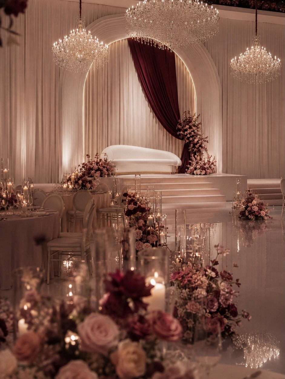
Velvet curtains in this color absorb light rather than reflect it, so the drapery itself needs its own illumination; uplighting behind the fabric or pin spots in front prevent the color from reading as flat brown in photographs.
Floor-to-ceiling panels frame an existing arch or doorway without structural changes, which matters in rental venues where nails and paint are restricted.
The weight of the fabric does the work, so simpler hanging hardware suffices; ceiling tracks or tension rods hold heavier material than people assume.
I would keep the drapery away from direct heat sources like candles or buffet warmers, since velvet scorch marks show pale and permanent.

【UPGRADE TWO SHAPES/SIZE】--Meeting various needs: Volens Large assorted votive candle holders bulk of 30, the round candle holders measure 2.91ʺ diameter (top) and 2.17ʺ height, and the cylinder candle holders measure 2.75ʺ diameter(top) and 3.15ʺ height approximately. It works with various tealight/votive/floating and flameless candles, and two different sizes also add some dimension to the table decor.

350PCS RED PLASTIC PLATES - Dinnerware set disposable includes 50 burgundy dessert plates, 50 red and gold plates, 50 pre rolled napkins, 50 Silverware and 50 cups, designed specifically for 50 guests to ensure your event is well prepared and guests are satisfied

Premium Quality Confetti Set: Rose Gold and Burgundy 200 counts dots confetti, each dots 1.2 inches in diameter, made from high quality craft paper
8. Burgundy Wedding Favors
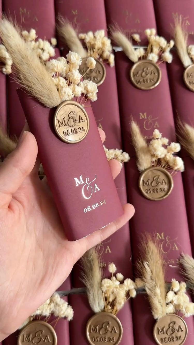
Small tubes in this color, sealed with wax and decorated with dried herbs, give guests something they can carry home without arranging logistics.
Dried florals last through summer heat better than fresh, so these favors survive outdoor reception tables and car dashboards alike.
Pampas grass adds volume but sheds; for transport, wrap stems inside the tube or skip them. I would fill with something useful, loose tea or honey sticks, rather than a keepsake that collects dust.

Choose this special burgundy pink flowers as your wedding or party decoration! There is a good variety of tonal flowers in different sizes, unique and beautiful, the large size burgundy roses will catch the eyes of guests easily
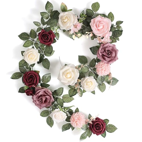
Size and Material: This Garisey handcrafted rose flower garland is 5 feet long and made of high-quality foam and silk.The rose leaves have a real texture.

❤️Material: Floroom Studio's artificial roses are crafted from soft, high-quality PE foam, which lends them the look and feel of fresh flowers.
9. Burgundy Dessert Table Display
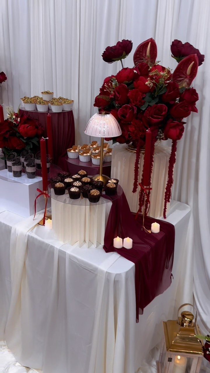
Draped fabric on a dessert table needs shape to avoid looking like hastily thrown bedsheets; gather the cloth at intervals with clips or ties beneath the surface that guests never see.
White stands lift the cupcakes to varied heights, and the burgundy reads as one layer among several rather than an overwhelming wash.
Taper candles put actual flame near fabric and sugar, so LED versions solve the safety problem without losing the thin vertical line that breaks up the horizontal table.
Tall floral arrangements read from across the room, though they block sight lines for anyone seated behind them; I would push those to the ends or keep them low if the table sits among guest tables rather than against a wall.

Size Tips: Crafted from soft breathable chiffon fabric for a structured fit. Please carefully review the size chart before ordering to select your correct size.

Fabric:Flowy Chiffon Bridesmaid Dresses for Women,fully lined polyester,built-in bra.

Size Tips: Crafted from lightweight chiffon with no stretch for a structured, elegant drape. The smocked elastic back adds flexibility for a more comfortable fit across different body shapes. Please refer to the size chart before ordering to select your best fit
10. Burgundy Suits for Groomsmen
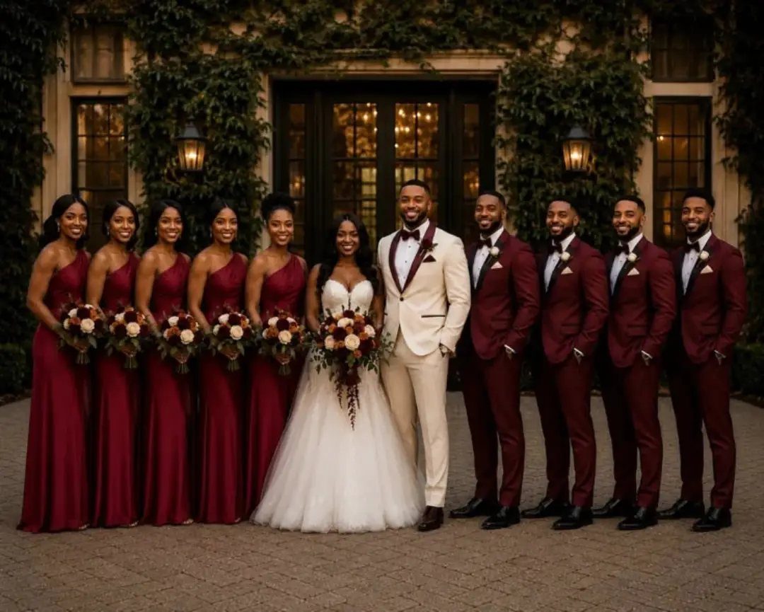
Burgundy suits read louder on a group than on a single groomsman, so the full set works best when the bride’s side is equally saturated; bridesmaids in the same color family let the group photograph as a coordinated unit rather than a contest.
Cream shirts under the jackets keep the neckline from disappearing into the jacket fabric, a problem that worsens in outdoor shade where the color goes darker still.
Tailoring matters more in colored suiting than in standard navy or charcoal, because off-the-rack fits bunch and pull in ways the eye notices when the cloth draws attention.
I would rent only if the rental stock carries this specific shade; a close-but-wrong burgundy looks borrowed, not chosen.

Premium Velvet Elegance - Crafted from heavyweight velvet fabric, these velvet blackout curtains offer a smooth touch, silky appearance, and graceful draping. Available in multiple refined colors, all hues feature fade-resistant dye technology to maintain vibrant richness. The plush velvet surface elevates luxury in bedrooms, living rooms, and offices.
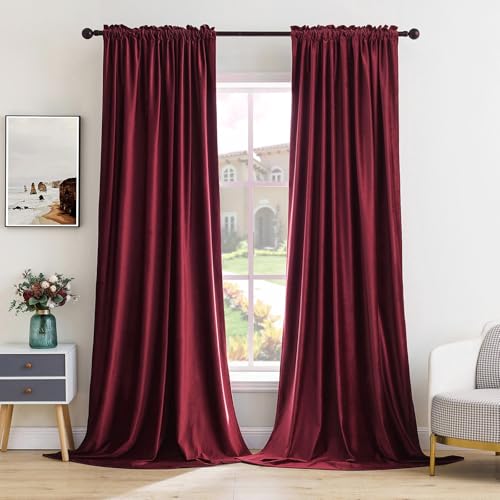
LUXURIOUS HEAVYWEIGHT VELVET: Each panel is cut from a dense single-layer velvet — soft and plush to the touch, heavy in the hand, weighted just enough to fall from rod to floor in clean, sculptural folds with an elegant sheen. Run your fingers across the full, fluffy pile and it gives a little, holds a lot, and softens every light source in the room into something warmer. There's real weight here, real drape, real hush the moment the fabric settles.

READY MADE : Sold as 2 panels, Each panel measuring 52" W x 84" L; two hanging options; rod pocket and clip rings; With 3-inch inner diameter fit most standard rod
Burgundy’s Seasonal Appeal
Burgundy carries its own temperature. In fall and winter, it reads as warmth against bare branches and early dark, which is why so many October-through-March weddings default to it.
The color does not need gold to feel rich in candlelight; that partnership is preferred, not required.
Spring and summer bring a different problem. Full burgundy against green grass and long daylight can drop to a single dark note that looks planned for the wrong month.
The adjustment is not to avoid the color but to dilute it: blush or cream as the visible majority, burgundy as the accent in napkins, a ribbon, a boutonniere.
The same floral budget buys lighter blooms as the bulk with burgundy roses for depth.
I would not split the difference and use an equal mix. The eye reads imbalance as intention; fifty-fifty reads as uncertainty.
Burgundy Accessories
Accessories carry burgundy without the commitment of a full garment, and they let you test the shade against different complexions before ordering dresses.
Groomsmen in standard navy or charcoal need a small unit of color to join the palette: a tie, a vest, or a pocket square, with a matching boutonniere to anchor it.
The suit stays versatile for future use; the wedding color stays present in photographs.
The bride has more choices and more risk. Burgundy shoes show in exactly 2 photographs and disappear under a floor-length gown for the rest of the day; a clutch or hairpin lasts as a visible accent through the reception.
Jewelry with burgundy stones, garnet or rhodolite, stays subtle against ivory or white without the bridal-shoe problem of color that never quite matches the rest of the party.
Bridesmaids already in burgundy dresses need only metal to finish: gold reads warmer, silver cooler, and either keeps the neckline from going bare.
Burgundy’s Romantic Symbolism
No color arrives at a wedding without someone assigning it meaning, and burgundy collects more than most: warmth, passion, luxury, every abstract noun that fits a sales brochure.
The facts are simpler. It is dark red with enough blue to recede in shadow and enough brown to register as grounded rather than electric.
That grounded quality is what makes it useful. In a season of reds that shout, burgundy speaks at a lower volume, which reads as formal without the effort of a black-tie requirement.
The romance is in the effect, not the symbolism; guests do not know the color code, they know the mood.
Pairings prove the point.
Burgundy and gold borrows from a long tradition of formal rooms and evening wear; the luxury is historical, not invented. Burgundy and blush softens the same tint into something that works by daylight.
The color does not mean one thing; it holds its value across different settings, which is more than can be said for shades that only function in a single season or light.